The opposite of orange on the color wheel is blue. In traditional color theory, blue sits directly across from orange, making it its complementary color. This strong contrast creates visual balance, increases color vibrancy, and is widely used in interior design, paint selection, home décor, fashion, art, and branding.
If you’re decorating a home, choosing paint colors, or designing a room, pairing orange and blue can help create spaces that feel energetic yet balanced. The exact shade of blue that complements orange depends on the specific orange hue and the color wheel model being used.
| Orange Shade | Opposite Blue Shade | Best Home Design Use |
| Bright Orange | Azure Blue | Modern Accent Walls |
| Burnt Orange | Brilliant Azure | Living Rooms |
| Terracotta | Slate Blue | Mediterranean Interiors |
| Peach | Navy Blue | Bedrooms |
| Pumpkin Orange | Vibrant Blue | Kids’ Rooms |
| Copper | Celestial Blue | Rustic Décor |
Why Does the Opposite of Orange Matter?
Understanding the opposite color of orange is one of the most valuable concepts in color theory. Whether you’re painting a room, selecting furniture, designing a website, creating artwork, or decorating a home, knowing how complementary colors work helps you make smarter design decisions.
Orange is considered a warm, energetic color associated with creativity, enthusiasm, comfort, and social interaction. Blue, its opposite, is often associated with calmness, stability, trust, and relaxation.
When these two colors are used together, they create one of the strongest visual contrasts available on the color wheel.
This contrast can:
- Make colors appear brighter
- Add depth to interior spaces
- Highlight architectural features
- Create balanced room designs
- Improve visual interest
- Establish focal points
For homeowners, understanding the relationship between orange and its opposite color can transform an ordinary room into a professionally styled space.
What Is the Opposite of Orange in Color Theory?
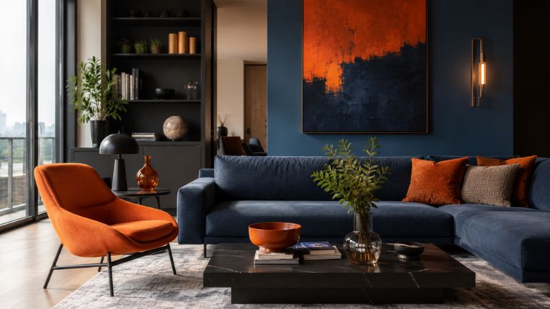
The complementary color of orange is blue. Complementary colors are colors positioned directly opposite each other on a color wheel. Because they occupy opposite positions, they naturally create contrast while maintaining visual harmony.
Color theorists have relied on complementary color relationships for centuries. Artists such as Vincent van Gogh frequently used orange and blue combinations to create dramatic effects in paintings.
Today, interior designers use the same principle when selecting:
- Wall colors
- Furniture finishes
- Accent décor
- Artwork
- Rugs
- Curtains
- Lighting features
The reason this pairing works so effectively is rooted in human visual perception.
When the eye sees orange, it naturally seeks balance through blue. This interaction creates visual excitement without feeling chaotic.
How Does the Color Wheel Determine the Opposite of Orange?
A color wheel is a visual representation of color relationships. Orange occupies a position between red and yellow.
Directly across from orange sits blue. The farther apart two colors are on the wheel, the greater their contrast.
Traditional RYB Color Wheel
The traditional Red-Yellow-Blue color wheel is commonly used in art and interior design.
In this model:
- Orange = Secondary Color
- Blue = Primary Color
- Blue is the direct opposite of orange
This is the version most homeowners and decorators reference when discussing paint colors and room styling.
Modern RGB Color Wheel
Digital designers use the RGB color model.
In RGB systems:
- Orange often opposes cyan-blue or azure-blue
- The exact opposite depends on digital color values
This is especially relevant for:
- Digital staging
- Interior design software
- Home visualization apps
- Virtual room planning tools
CMYK Color Wheel
Print designers often use CMYK color systems. In this model, orange generally opposes a cyan-blue hue.
While slight variations exist, the overall concept remains unchanged:
Orange and blue remain complementary colors.
Why Do Orange and Blue Work So Well Together?
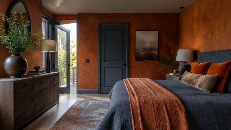
The answer lies in visual balance.
Orange is a warm color.
Blue is a cool color.
When paired, they naturally balance each other’s energy.
Warm Meets Cool
Orange brings:
- Warmth
- Excitement
- Energy
- Sociability
Blue contributes:
- Calmness
- Stability
- Relaxation
- Trustworthiness
Together they create a harmonious environment that feels both inviting and comfortable. This balance is particularly valuable in residential design.
What Does Science Say About Complementary Colors?
Research in visual perception shows that complementary colors create stronger contrast than neighboring colors.
According to color theory principles taught in art, design, and environmental psychology programs worldwide, complementary pairings improve visual recognition and increase attention.
This is one reason orange and blue appear frequently in:
- Advertising
- Sports branding
- Website design
- Interior design
- Product packaging
Humans naturally notice complementary color pairings faster than many other combinations.
For homeowners, this means orange and blue can help create focal points without requiring expensive renovations.
How Do Different Shades of Orange Affect the Opposite Color?
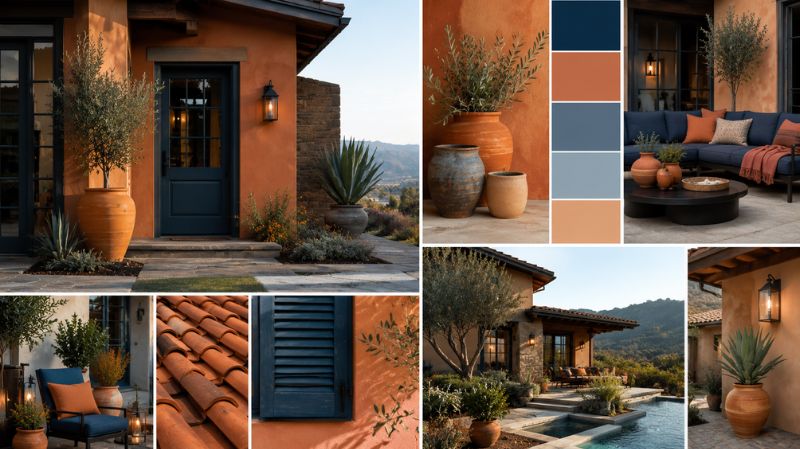
Not all oranges are identical.
Each orange hue has a slightly different complementary blue.
Bright Orange
Bright orange typically pairs with vibrant azure blue.
This creates bold modern interiors.
Common applications include:
- Contemporary living rooms
- Accent furniture
- Statement walls
Burnt Orange
Burnt orange pairs beautifully with deeper blues.
Popular combinations include:
- Navy blue
- Denim blue
- Brilliant azure
This combination remains one of the most popular interior design trends.
Terracotta Orange
Terracotta has become a favorite among designers.
Its earthy character pairs exceptionally well with:
- Slate blue
- Dusty blue
- Steel blue
This combination creates a sophisticated Mediterranean-inspired aesthetic.
Peach Orange
Peach works best with:
- Soft navy
- Dusty blue
- Muted blue-gray
These combinations help create peaceful bedrooms and relaxing sitting areas.
How Is Orange Used in Interior Design?
Orange has experienced a significant revival in modern home design.
While it was heavily associated with the 1970s, today’s designers use orange in more sophisticated ways.
Rather than covering entire rooms in bright orange, they strategically introduce it through accents and focal points.
Popular Ways Designers Use Orange
- Accent walls
- Decorative pillows
- Artwork
- Upholstered chairs
- Area rugs
- Curtains
- Decorative ceramics
Used correctly, orange adds warmth without overwhelming a space.
Why Are Orange and Blue Popular in Home Décor?
Orange and blue offer something many color combinations cannot:
Contrast with balance. This makes them ideal for modern homes.
Benefits of Orange and Blue Rooms
- Strong visual interest
- Timeless appeal
- Easy customization
- Works across multiple design styles
- Suitable for both large and small spaces
Many professional decorators consider this pairing one of the safest complementary color schemes because it remains versatile.
Which Rooms Benefit Most from Orange and Blue Color Schemes?
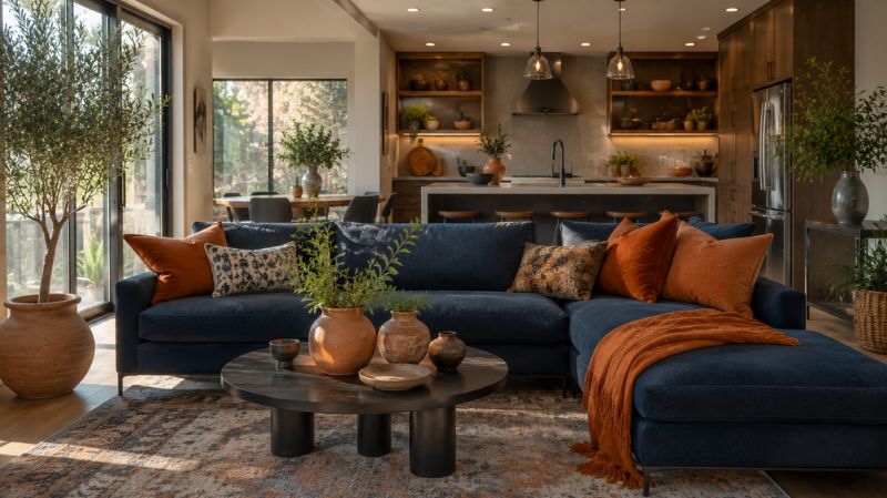
Certain spaces naturally benefit from this combination.
Living Rooms
Living rooms thrive on energy and comfort.
Orange adds warmth.
Blue prevents the room from feeling overwhelming.
Designer Tip:
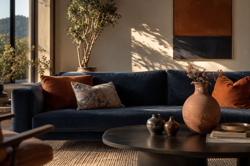
Use a navy sofa paired with burnt orange cushions.
Bedrooms
Bedrooms require relaxation.
Choose muted oranges and soft blues.
Examples include:
- Terracotta and dusty blue
- Peach and navy
- Rust and slate blue
These combinations feel cozy yet calming.
Home Offices
Orange stimulates creativity.
Blue promotes focus.
Together they create an ideal work environment.
Many productivity-focused office designs use subtle versions of these colors.
Dining Rooms
Orange encourages conversation and appetite.
Blue balances the overall mood.
A dining room with terracotta accents and blue artwork often feels welcoming and sophisticated.
What Are the Best Blue Paint Colors That Complement Orange?
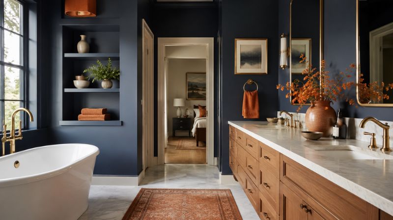
If you’re selecting wall colors, several blue paint families work particularly well.
Navy Blue
One of the strongest companions to orange.
Best for:
- Living rooms
- Libraries
- Dining rooms
Slate Blue
Creates a sophisticated look.
Excellent for:
- Modern interiors
- Transitional homes
- Farmhouse designs
Dusty Blue
Soft and elegant.
Ideal for:
- Bedrooms
- Nurseries
- Reading spaces
Teal Blue
Offers a contemporary twist.
Pairs beautifully with:
- Burnt orange
- Copper accents
- Walnut furniture
Sky Blue
Light and cheerful.
Works particularly well in:
- Coastal homes
- Sunrooms
- Casual family rooms
Life Example: Transforming a Dated Living Room
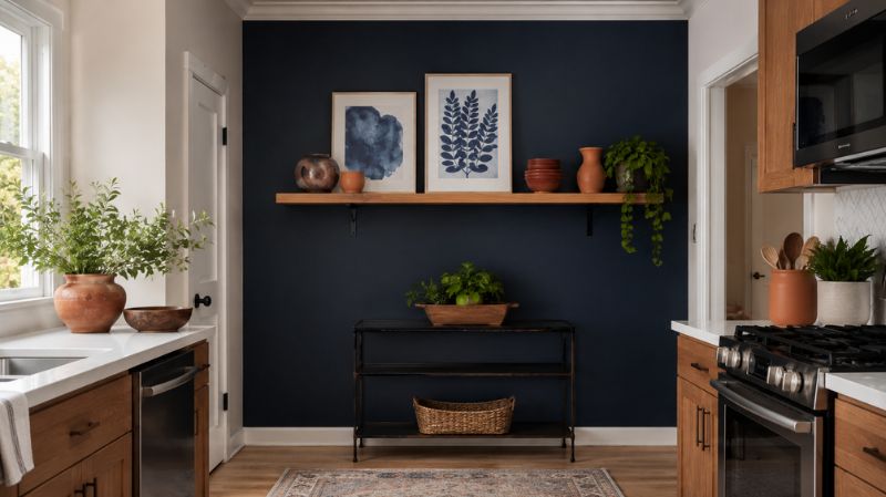
A homeowner with beige walls and outdated furniture wanted a more inviting living room without a complete remodel.
Instead of replacing everything, they:
- Painted one wall navy blue
- Added burnt orange throw pillows
- Introduced terracotta pottery
- Hung blue-toned artwork
- Added a patterned area rug featuring both colors
The total update cost less than a major renovation.
Yet the room immediately gained depth, character, and designer-level appeal.
This demonstrates how understanding the complementary color of orange can lead to practical, budget-friendly home improvements.
What Does Orange Symbolize in Home Color Psychology?
Orange is often associated with:
- Enthusiasm
- Creativity
- Optimism
- Warmth
- Hospitality
- Energy
In residential design, orange tends to make spaces feel more social and welcoming.
This is why orange frequently appears in:
- Kitchens
- Dining rooms
- Family rooms
- Entertainment areas
Used in moderation, orange creates an inviting atmosphere without becoming overpowering.
What Does Blue Symbolize in Home Color Psychology?
Blue has nearly the opposite psychological effect.
It is associated with:
- Calmness
- Trust
- Stability
- Serenity
- Concentration
This makes blue a popular choice for:
- Bedrooms
- Bathrooms
- Home offices
- Reading rooms
When combined with orange, homeowners enjoy the benefits of both emotional responses.
What Happens When Orange and Blue Are Used Together in a Room?
When orange and blue appear together, they create what designers call complementary harmony. Because these colors sit opposite each other on the color wheel, they naturally enhance each other’s intensity.
The result is a room that feels visually dynamic without appearing cluttered.
Interior designers often follow the 60-30-10 rule when decorating with complementary colors:
- 60% dominant color (usually a neutral)
- 30% secondary color
- 10% accent color
For example:
- Warm white walls (60%)
- Navy blue sofa (30%)
- Burnt orange cushions and décor (10%)
This approach prevents either color from overwhelming the room while maintaining balance.
What Is the Opposite of Different Orange Shades?
Not all oranges have the same complementary blue.
The exact opposite depends on the orange’s undertones, brightness, and saturation.
Understanding these pairings helps homeowners choose paint colors, furniture, and accessories more confidently.
What Is the Opposite of Pumpkin Orange?
Pumpkin orange is bold, vibrant, and energetic.
Its complementary color falls within the vivid blue family, often described as bright azure or electric blue.
Best Home Design Applications
- Halloween-inspired décor
- Children’s bedrooms
- Creative studios
- Accent furniture
Recommended Pairings
- Pumpkin orange pillows with blue sofas
- Azure accent walls with orange décor
- Blue artwork on orange-toned walls
What Is the Opposite of Burnt Orange?
Burnt orange remains one of the most popular interior design colors today.
Its complementary color is generally a brilliant azure or deep navy-blue tone.
Why Designers Love This Combination
Burnt oranges provide warmth.
Blue provides stability.
Together they create a sophisticated look suitable for:
- Modern farmhouse interiors
- Mid-century modern homes
- Rustic living rooms
- Luxury apartments
Popular Pairings
- Burnt orange leather chairs
- Navy blue walls
- Walnut wood furniture
- Brass accents
What Is the Opposite of Terracotta?
Terracotta is an earthy orange inspired by clay and Mediterranean architecture.
Its opposite is generally found within muted blue-gray families.
Designer Favorites
- Slate blue
- Steel blue
- Dusty blue
- Smoky navy
Best Rooms
- Living rooms
- Kitchens
- Sunrooms
- Outdoor entertaining spaces
Terracotta and slate blue have become one of the most searched color combinations in home décor because they feel both timeless and contemporary.
What Is the Opposite of Peach?
Peach contains significant yellow and pink undertones.
Its complementary color is typically a deeper navy or blue-gray.
Why This Pairing Works
Peach softens interiors.
Navy adds structure and sophistication.
Best Uses
- Bedrooms
- Nurseries
- Guest rooms
- Coastal-inspired homes
What Is the Opposite of Copper?
Copper is an orange-brown metallic tone frequently used in home décor.
Its complementary color is often described as celestial blue.
Beautiful Pairings
- Copper pendant lighting
- Blue kitchen islands
- Blue cabinetry
- Copper hardware
This combination has become increasingly popular in luxury kitchen renovations.
What Is the Opposite of Coral and Salmon?
Coral and salmon sit between orange and pink.
Their complementary colors often fall within teal-blue or blue-green families.
Great Design Applications
- Coastal interiors
- Beach houses
- Modern bathrooms
- Contemporary bedrooms
These softer pairings create a more relaxed appearance than traditional orange-and-blue contrasts.
Comparison Table: Popular Orange Shades and Their Opposites
| Orange Hue | Complementary Blue Hue | Recommended Room |
| Bright Orange | Azure Blue | Home Office |
| Burnt Orange | Navy Blue | Living Room |
| Terracotta | Slate Blue | Kitchen |
| Peach | Dusty Navy | Bedroom |
| Copper | Celestial Blue | Kitchen |
| Coral | Teal Blue | Bathroom |
| Salmon | Blue-Green | Guest Room |
| Pumpkin Orange | Electric Blue | Playroom |
How Can You Find the Exact Opposite of Any Orange Color?
Finding the exact opposite color is easier than ever.
For Digital Designers
Most design software includes:
- Color picker tools
- Complementary color generators
- HEX code calculators
Popular platforms include:
- Adobe Color
- Canva
- Figma
- Photoshop
Simply enter the orange HEX code to generate its precise complementary blue.
For Homeowners Choosing Paint Colors
Paint brands often provide digital visualization tools.
These tools allow you to:
- Upload room photos
- Test orange paint colors
- Generate complementary color suggestions
This can prevent costly painting mistakes.
How Do Professional Interior Designers Use Orange and Blue?
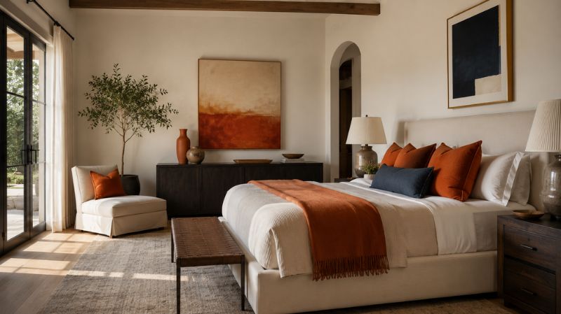
Professional designers rarely use equal amounts of both colors.
Instead, they strategically control color dominance.
Method 1: Blue Foundation, Orange Accents
This is the most common approach.
Examples include:
- Blue walls
- Orange pillows
- Orange artwork
- Terracotta vases
Method 2: Orange Feature, Blue Balance
Examples:
- Burnt orange accent wall
- Blue sectional sofa
- Blue rugs
- Blue decorative accessories
Method 3: Neutral Base with Both Colors
Examples:
- Beige walls
- Navy furniture
- Orange décor accents
This method works particularly well in open-concept homes.
What Are the Best Wall Colors to Pair with Orange?
While blue is the opposite color of orange, several neutrals also complement orange beautifully.
Neutral Wall Colors
Warm White
Creates a bright, airy appearance.
Greige
Offers warmth and sophistication.
Soft Gray
Balances orange without creating excessive contrast.
Taupe
Adds elegance and depth.
Cream
Produces a welcoming atmosphere.
These colors work exceptionally well when orange appears through furniture or decorative accessories.
What Furniture Colors Work Best with Orange?
Furniture selection plays a major role in successful color schemes.
Blue Furniture
One of the safest options.
Examples:
- Navy sofas
- Blue velvet chairs
- Slate blue sectionals
Natural Wood Furniture
Wood naturally softens orange.
Best finishes:
- Walnut
- Oak
- Teak
Black Furniture
Creates dramatic contrast.
Ideal for contemporary spaces.
White Furniture
Helps brighten rooms containing strong orange accents.
What Design Styles Use Orange and Blue Most Effectively?
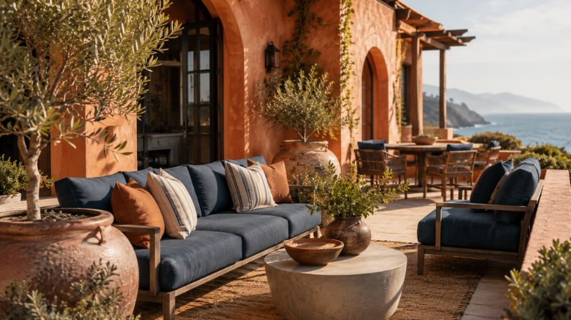
Several interior design styles embrace this complementary pairing.
Mid-Century Modern
Burnt orange remains a defining feature of mid-century design.
Pair it with:
- Navy blue
- Walnut wood
- Brass fixtures
Coastal Design
Coral oranges pair beautifully with ocean-inspired blues.
Mediterranean Design
Terracotta and slate blue dominate many Mediterranean interiors.
Bohemian Design
Orange and blue textiles create rich, layered spaces.
Contemporary Design
Clean-lined furniture combined with bold orange accents creates visual interest.
Common Mistakes to Avoid When Using Orange and Blue
Even complementary colors can look overwhelming if used incorrectly.
Mistake #1: Using Too Much Bright Orange
Bright orange should generally remain an accent color.
Mistake #2: Ignoring Lighting Conditions
Natural and artificial lighting significantly affect color appearance.
Always test paint samples first.
Mistake #3: Matching Everything
Rooms feel more natural when shades vary slightly.
Mistake #4: Forgetting Neutral Elements
Neutrals help balance strong complementary colors.
Mistake #5: Using Equal Saturation Levels
If orange is bold, consider a muted blue.
If blue is intense, soften the orange.
Authority Insight: Why Complementary Colors Continue to Dominate Design
Color theory principles developed centuries ago remain foundational in modern design education.
Organizations such as the International Association of Color Consultants/Designers (IACC) and leading design schools continue to teach complementary color relationships because they reliably create visual harmony.
Major paint manufacturers including Sherwin-Williams, Benjamin Moore, and Behr regularly showcase blue-orange pairings in trend forecasts because consumers consistently respond positively to warm-cool balance.
This enduring popularity demonstrates that understanding the opposite of orange, the opposite color of orange, and the broader relationship between orange and its opposite color is not merely an artistic exercise—it is a practical tool for creating beautiful, functional homes.
Conclusion
Yet understanding the relationship between orange and blue goes far beyond a simple color-wheel fact. These complementary colors influence how rooms feel, how furniture stands out, how paint colors interact, and even how people emotionally respond to a space.
Whether you’re choosing a navy accent wall, decorating with burnt orange furniture, selecting terracotta accessories, or planning an entire room makeover, knowing the complementary color of orange gives you a powerful design advantage.
The best interiors rarely happen by accident. They result from intentional color choices that create harmony, balance, and personality.
When used correctly, orange and blue can make a living room feel more inviting, a bedroom more relaxing, a home office more productive, and an entire home more visually appealing.
The next time you’re selecting paint colors, shopping for furniture, or refreshing your décor, remember one of the most important principles in color theory:
Orange and its opposite color work together to create some of the most timeless, eye-catching, and designer-approved spaces possible.
Frequently Asked Questions
1. What is the opposite of orange on the color wheel?
The opposite of orange on the traditional color wheel is blue. These two colors are complementary colors and create strong visual contrast.
2. What is the complementary color of orange?
The complementary color of orange is blue. Depending on the shade of orange, the complementary blue may range from navy to azure.
3. Is blue always the opposite color of orange?
Yes, in most color theory systems blue remains the complementary counterpart of orange, although the exact hue may vary.
4. What color neutralizes orange?
Blue neutralizes orange because complementary colors cancel each other out when mixed appropriately.
5. What shade of blue goes best with burnt orange?
Navy blue, slate blue, and brilliant azure are among the best pairings for burnt orange.
6. Can orange and blue be used in small rooms?
Absolutely. Using blue as the dominant color and orange as an accent can make small rooms feel balanced and stylish.
7. Is terracotta considered orange?
Yes. Terracotta is a muted earthy orange commonly used in interior design and architecture.
8. What wall colors work best with orange furniture?
Blue, gray, greige, cream, taupe, and warm white walls all pair beautifully with orange furniture.
9. Why do designers use orange and blue together?
Because they are complementary colors that create visual balance, energy, and contrast while remaining harmonious.
10. Is orange a good color for home décor?
Yes. Orange adds warmth, personality, creativity, and comfort when used thoughtfully throughout a home.


