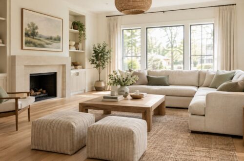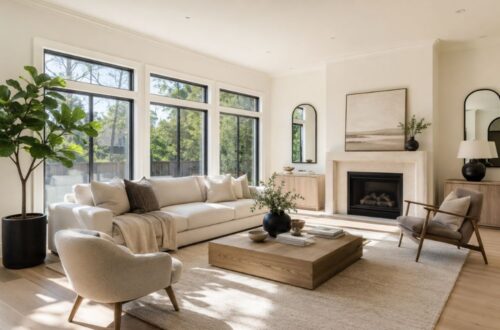
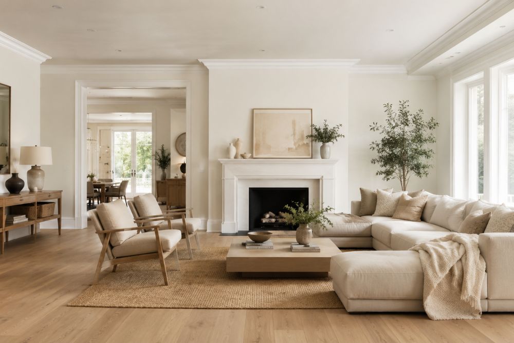
Yes, Alabaster walls with Pure White trim are one of the most timeless and designer-approved paint combinations for modern homes. Sherwin Williams Alabaster (SW 7008) provides soft warmth and subtle depth, while Pure White (SW 7005) delivers a clean, crisp trim that highlights architectural details without creating harsh contrast.
This white-on-white pairing works beautifully in coastal, farmhouse, transitional, Scandinavian, and contemporary interiors because it creates a bright, welcoming atmosphere that feels sophisticated rather than stark.
Quick Answer Box
| Feature | Alabaster SW 7008 | Pure White SW 7005 |
| Color Family | Warm White | Soft Neutral White |
| LRV | 82 | 84 |
| Undertones | Beige, Yellow, Gray | Slight Yellow, Gray |
| Best Use | Walls, Exterior, Ceilings | Trim, Cabinets, Doors |
| Room Types | Living Rooms, Bedrooms, Kitchens | Trim, Millwork, Baseboards |
| Design Styles | Coastal, Farmhouse, Traditional, Modern | Modern, Transitional, Contemporary |
| Overall Effect | Cozy and Inviting | Clean and Refined |
Why Are Alabaster Walls With Pure White Trim So Popular?
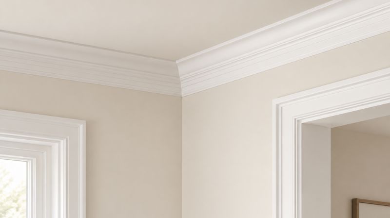
The popularity of Alabaster walls Pure White trim can be traced to one simple reason: balance.
Many white paint combinations fail because they create too much contrast. Some whites are overly bright, making walls appear dingy. Others are too creamy, causing trim to disappear completely.
Alabaster and Pure White solve both problems.
Alabaster delivers warmth without appearing yellow. Pure White remains crisp without looking sterile. Together they create subtle visual separation that feels elegant and intentional.
This combination has become increasingly popular among homeowners seeking a brighter home without sacrificing comfort.
Interior designers frequently recommend this pairing because it works with virtually every decorating style and adapts well to changing furniture and décor trends.
What Is Sherwin Williams Alabaster SW 7008?
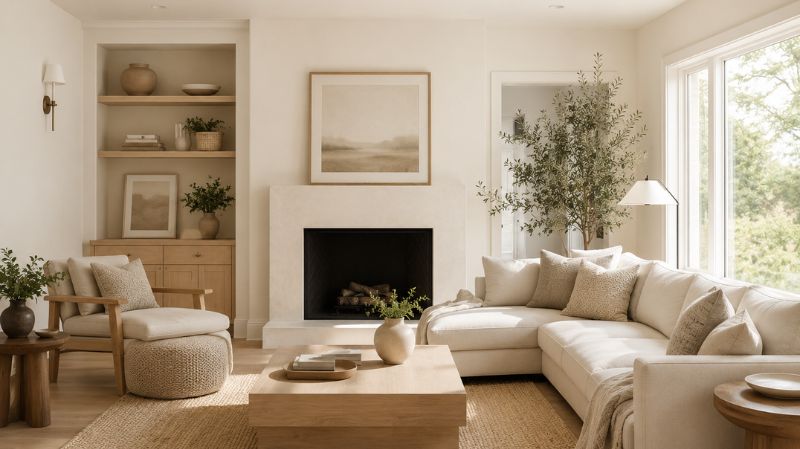
Why Is Alabaster One of America’s Most Popular White Paint Colors?
Sherwin Williams Alabaster became one of the most requested white paint colors after being selected as the Sherwin Williams Color of the Year.
It continues to dominate interior design projects because it combines warmth, versatility, and softness.
Alabaster Specifications
- Paint Name: Alabaster SW 7008
- Color Family: White
- LRV: 82
- Hex Code: #EDEAE0
- Undertones: Beige, Yellow, Gray
- Best Applications:
- Walls
- Ceilings
- Exteriors
- Bedrooms
- Living Rooms
- Kitchens
Unlike stark whites, Alabaster contains enough warmth to prevent rooms from feeling cold.
This makes it particularly attractive in homes with limited natural sunlight.
What Is Sherwin Williams Pure White SW 7005?
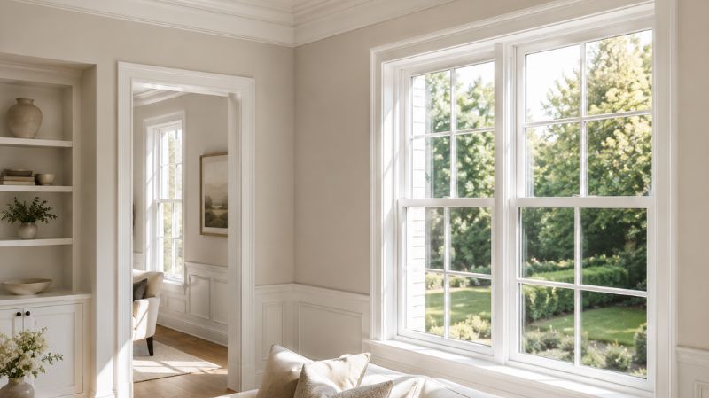
Why Do Designers Love Pure White for Trim?
Pure White is among Sherwin Williams’ most versatile whites.
Despite its name, it is not a bright, clinical white.
Instead, Pure White contains subtle warm undertones that help it blend seamlessly with warmer wall colors.
Pure White Specifications
- Paint Name: Pure White SW 7005
- Color Family: White
- LRV: 84
- Hex Code: #EDECE6
- Undertones: Slight Yellow and Gray
- Best Applications:
- Trim
- Doors
- Cabinets
- Ceilings
- Crown Molding
Because Pure White is only slightly brighter than Alabaster, the result is a sophisticated low-contrast appearance.
Why Do Alabaster Walls and Pure White Trim Work So Well Together?
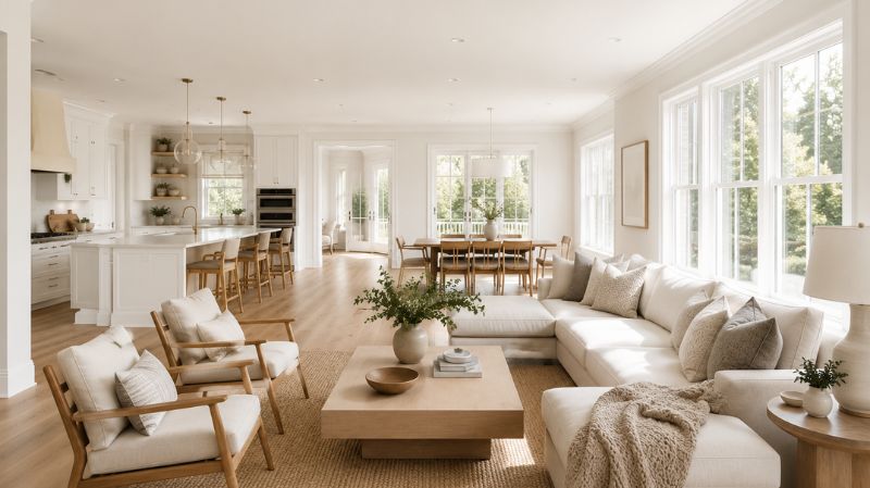
Is the Contrast Too Low?
Not at all.
In fact, the subtle contrast is exactly what makes the pairing successful.
Many homeowners assume trim must be dramatically brighter than walls.
Professional designers often disagree.
A softer contrast produces a more luxurious appearance because it avoids sharp visual interruptions.
Benefits include:
- Smoother room flow
- Larger visual appearance
- Softer transitions
- More natural light reflection
- Greater decorating flexibility
The result feels calm, curated, and expensive.
How Do LRV Values Affect This Combination?
LRV stands for Light Reflectance Value.
The scale measures how much light a color reflects.
LRV Comparison
| Paint Color | LRV |
| Alabaster | 82 |
| Pure White | 84 |
The difference is only 2 points.
This close relationship explains why the colors blend beautifully while still allowing trim details to stand out.
Homes with smaller rooms especially benefit from this combination because high-LRV colors help bounce light throughout the space.
What Role Do Undertones Play?
Undertones determine whether colors complement or fight each other.
Alabaster Undertones
- Warm beige
- Soft yellow
- Touch of gray
Pure White Undertones
- Light gray
- Hint of yellow
Because both colors share warm undertones, they remain visually harmonious.
This is one reason why Pure White trim with Alabaster walls appears natural rather than forced.
By contrast, cooler whites often exaggerate Alabaster’s yellow-beige qualities and create unwanted visual tension.
What Does Color Psychology Say About This Combination?
Color psychology plays a major role in home design.
White interiors consistently rank among the most desirable paint choices because they communicate:
- Cleanliness
- Calmness
- Simplicity
- Comfort
- Spaciousness
Alabaster enhances these qualities by introducing warmth.
Pure White reinforces clarity and structure.
Together they create a home environment that feels:
- Relaxing
- Airy
- Welcoming
- Sophisticated
This explains why many homeowners immediately feel comfortable in spaces painted with these colors.
How Do Alabaster Walls With White Trim Look in Different Rooms?
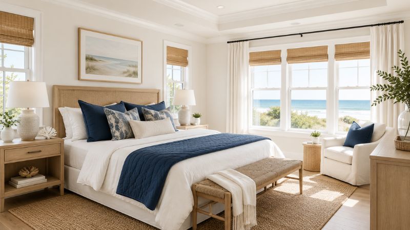
Living Room
The living room is where this paint pairing truly shines.
Alabaster walls create a soft backdrop that allows furniture, rugs, artwork, and accessories to become focal points.
Pure White trim frames windows and architectural features without drawing excessive attention.
Designer Tips
Pair with:
- Light oak furniture
- Linen upholstery
- Navy accents
- Black metal fixtures
- Natural fiber rugs
The result is a space that feels bright yet grounded.
Bedroom
Bedrooms benefit tremendously from warm white paint colors.
Unlike cooler whites that can feel sterile, Alabaster promotes relaxation.
Pure White trim provides just enough contrast to keep the room visually interesting.
Best Bedroom Pairings
- White bedding
- Beige throws
- Natural wood nightstands
- Soft gray accent pillows
- Brass lighting
The overall effect resembles a boutique hotel retreat.
Kitchen
Modern kitchens increasingly embrace warm white palettes.
Alabaster walls with white trim create a timeless backdrop that works with almost every cabinet style.
Popular pairings include:
- White shaker cabinets
- Quartz countertops
- Marble backsplashes
- Brass hardware
- Matte black fixtures
Many homeowners specifically choose Alabaster walls with Pure White trim because the combination brightens kitchens without appearing cold.
Bathroom
Bathrooms painted with Alabaster often feel larger and more luxurious.
Pure White trim enhances cleanliness while maintaining warmth.
Best Bathroom Materials
- White subway tile
- Marble surfaces
- Oak vanities
- Matte black hardware
- Brushed brass accents
The result feels spa-inspired and timeless.
Dining Room
Dining rooms painted in Alabaster become more inviting and elegant.
The warm undertones help candlelight, pendant lighting, and natural sunlight feel softer.
Pure White trim provides subtle definition around windows and moldings.
This works especially well in traditional and transitional homes.
Home Office
Remote work has increased demand for comfortable home office environments.
Alabaster provides brightness without causing eye fatigue.
Pure White trim keeps the room feeling professional and polished.
Together they create an ideal productivity-focused environment.
Life Example: A Coastal Family Home Transformation
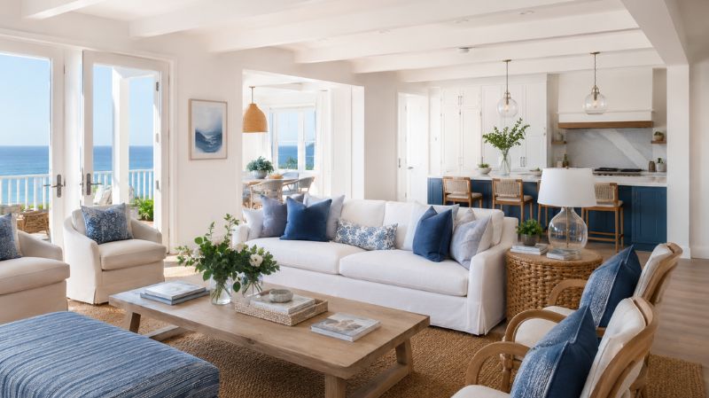
A homeowner renovating a coastal-inspired property wanted a brighter interior but feared stark white walls.
After testing several popular white paint colors, they selected Alabaster for the walls and Pure White for the trim.
The results were noticeable immediately.
The living room appeared larger.
Natural light reflected more evenly.
Existing oak furniture looked richer.
Blue coastal décor became more vibrant.
Most importantly, the home felt fresh while maintaining warmth.
This real-world example demonstrates why Alabaster with Pure White trim exterior and interior applications continue to gain popularity among homeowners seeking timeless appeal.
Authority Insight: Why White Paints Continue to Dominate Residential Design
According to annual paint industry trend reports from leading manufacturers and design organizations, white and off-white paint colors remain among the most requested residential paint selections year after year.
The National Association of Realtors has also repeatedly identified neutral paint colors as one of the most effective home improvement strategies for broad buyer appeal.
Design professionals often recommend warm whites like Alabaster because they create flexibility for future furniture changes, remodeling projects, and evolving design preferences.
Unlike trendy colors that may feel dated within a few years, classic warm whites maintain long-term value and timeless appeal.
What Furniture Colors Look Best With Alabaster Walls and Pure White Trim?
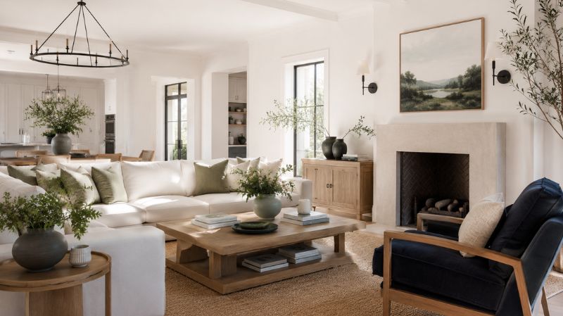
One of the biggest advantages of Alabaster walls Pure White trim is versatility.
Because both colors function as soft neutrals, they allow homeowners to experiment with a wide range of furniture styles and color palettes without creating visual conflict.
Natural Wood Furniture
Natural wood remains one of the safest and most beautiful pairings.
Best options include:
- White Oak
- Light Walnut
- Reclaimed Wood
- Maple
- Pine
Wood introduces warmth and texture that prevents white rooms from feeling flat.
White and Cream Furniture
Layering whites creates a designer-inspired look.
Popular combinations include:
- Cream linen sofas
- White slipcovered chairs
- Ivory bedding
- Textured boucle fabrics
The subtle variations create depth while maintaining a cohesive aesthetic.
Black Accent Furniture
Black elements create contrast and sophistication.
Examples include:
- Coffee tables
- Picture frames
- Light fixtures
- Cabinet hardware
- Dining chairs
The black-and-white contrast appears especially striking against warm Alabaster walls.
Navy Blue Furniture
Navy remains one of the most popular accent colors for white interiors.
Why it works:
- Adds visual weight
- Complements warm whites
- Creates a coastal aesthetic
- Enhances traditional interiors
Sage Green and Olive Furniture
Nature-inspired colors continue to dominate interior design.
Sage green creates:
- Calmness
- Organic warmth
- Modern farmhouse appeal
- Soft contrast
These tones pair beautifully with Alabaster walls with white trim.
What Accent Colors Pair Best With Alabaster Walls?
Many homeowners wonder whether white walls limit decorating options.
The opposite is true.
Alabaster acts as a neutral canvas capable of supporting nearly any accent color.
Soft Blues
Soft blues are ideal for:
- Coastal homes
- Beach-inspired interiors
- Bedrooms
- Living rooms
Recommended shades:
- Sea Salt
- Misty Blue
- Powder Blue
- Sky Blue
These colors reinforce the airy atmosphere created by Alabaster and Pure White.
Sage Green
Sage green has become one of the most requested decorating colors.
Benefits include:
- Natural appearance
- Relaxing atmosphere
- Timeless appeal
- Excellent compatibility with warm whites
Charcoal Gray
For homeowners seeking more drama:
- Charcoal furniture
- Dark artwork
- Gray stone fireplaces
These elements create visual depth without overwhelming the room.
Terracotta and Earth Tones
Earth-inspired décor continues growing in popularity.
Try incorporating:
- Terracotta pottery
- Rust-colored pillows
- Clay accessories
- Warm leather furniture
These additions emphasize Alabaster’s warm undertones.
What Flooring Looks Best With Alabaster Walls and Pure White Trim?
Flooring significantly influences how white paint appears.
The right floor can enhance warmth, while the wrong choice can make whites feel disconnected.
Light Oak Hardwood
Light oak remains one of the most designer-approved options.
Benefits include:
- Bright appearance
- Natural warmth
- Timeless style
- Excellent resale value
Medium-Tone Hardwood
Medium brown floors provide slightly stronger contrast.
Popular species include:
- White Oak
- Hickory
- Walnut
- Acacia
These floors anchor bright white walls beautifully.
Luxury Vinyl Plank (LVP)
Modern LVP offers:
- Durability
- Affordability
- Water resistance
- Realistic wood visuals
Many homeowners choose Alabaster walls with Pure White trim specifically because they complement almost every LVP finish.
Natural Stone Flooring
Stone creates a high-end appearance.
Excellent options include:
- Travertine
- Limestone
- Marble
- Slate
The combination feels luxurious and timeless.
How Does Lighting Affect Alabaster Walls?
Lighting can dramatically influence paint color appearance.
Understanding room orientation helps homeowners avoid surprises.
North-Facing Rooms
North-facing rooms receive cooler light.
Alabaster’s warm undertones help compensate for this coolness.
Benefits include:
- Reduced gray appearance
- Added warmth
- Balanced atmosphere
This is one reason designers frequently recommend Alabaster for northern exposures.
South-Facing Rooms
South-facing rooms receive warm sunlight throughout the day.
Alabaster appears:
- Bright
- Creamy
- Softly golden
Pure White trim remains crisp without becoming stark.
East-Facing Rooms
Morning sunlight enhances warmth.
Expect:
- Soft creaminess during mornings
- More neutral appearance during afternoons
West-Facing Rooms
Afternoon sunlight introduces warmer golden tones.
Many homeowners love this effect because it creates a cozy atmosphere during evening hours.
What Interior Design Styles Work Best With This Paint Combination?
Coastal Design
Few combinations work better for coastal interiors.
Characteristics include:
- White walls
- Natural textures
- Blue accents
- Light woods
- Airy décor
Alabaster and Pure White create the perfect foundation.
Modern Farmhouse
Farmhouse interiors often rely on warm whites.
This pairing complements:
- Shiplap
- Reclaimed wood
- Black hardware
- Rustic furnishings
without feeling overly rustic.
Transitional Design
Transitional homes blend traditional and modern elements.
Because Alabaster feels timeless, it works seamlessly within this style.
Scandinavian Design
Scandinavian interiors emphasize:
- Simplicity
- Functionality
- Natural materials
- Light-filled spaces
Alabaster walls and Pure White trim align perfectly with these principles.
Contemporary Design
Contemporary homes often require cleaner palettes.
The subtle contrast between these two whites creates sophistication without excessive ornamentation.
Can You Use Alabaster Walls With Pure White Trim on Exteriors?
Absolutely.
Many homeowners choose Alabaster with Pure White trim exterior applications because the combination delivers timeless curb appeal.
Why It Works Outdoors
Benefits include:
- Soft contrast
- Bright appearance
- Excellent sunlight reflection
- Broad architectural compatibility
The pairing works especially well on:
- Coastal homes
- Farmhouses
- Traditional homes
- Craftsman homes
- New construction properties
Best Front Door Colors
Popular front door choices include:
Urbane Bronze
Creates a rich, dramatic contrast.
Naval
Provides classic coastal appeal.
Iron Ore
Adds contemporary sophistication.
Forest Green
Introduces natural elegance.
Black
Creates timeless curb appeal.
What Are the Best Alternatives to Pure White Trim?
Although Pure White remains one of the most recommended options, some homeowners prefer different levels of contrast.
Alabaster Trim
For a color-drenched look:
- Walls: Alabaster
- Trim: Alabaster
- Different sheen levels
This creates seamless elegance.
Accessible Beige Trim
Accessible Beige provides more noticeable contrast.
Benefits:
- Transitional style
- Traditional warmth
- Stronger architectural framing
Shoji White Trim
Shoji White offers subtle contrast with creamy undertones.
Perfect for:
- Modern organic interiors
- Japandi spaces
- Layered neutral palettes
Extra White Trim
Extra White creates significantly more contrast.
Best used when homeowners desire:
- Crisper details
- Brighter trim
- Contemporary aesthetics
However, Extra White may emphasize Alabaster’s creamy undertones more strongly.
What Common Mistakes Should Homeowners Avoid?
Choosing the Wrong Ceiling Color
Many homeowners forget that ceilings affect overall color perception.
Best options include:
- Pure White
- Alabaster
- Flat ceiling white
Ignoring Natural Light
Paint always changes based on:
- Window orientation
- Seasonal sunlight
- Surrounding landscaping
Always sample before painting.
Using Stark Decor Everywhere
White rooms still require contrast.
Add:
- Wood
- Textiles
- Metals
- Artwork
- Plants
to create balance.
Skipping Sample Testing
Never choose paint solely from online images.
Large sample boards reveal undertones that tiny swatches often hide.
Alabaster vs Other Popular White Paint Colors
| Color | LRV | Undertone | Best Use |
| Alabaster | 82 | Beige, Yellow, Gray | Walls |
| White Dove | 85 | Soft Cream | Whole House |
| Swiss Coffee | 83 | Warm Cream | Traditional Homes |
| Greek Villa | 84 | Warm White | Interiors & Exteriors |
| Simply White | 91 | Bright Warm White | Modern Homes |
Alabaster stands out because it balances warmth and neutrality exceptionally well.
Final Verdict
Alabaster walls with Pure White trim continue to rank among the most versatile and designer-approved paint combinations available today.
The warmth of Alabaster prevents rooms from feeling cold, while the crispness of Pure White enhances architectural details and creates subtle sophistication.
Whether you’re renovating a coastal cottage, decorating a modern farmhouse, refreshing a traditional family home, or designing a new construction property, this pairing offers a timeless foundation that works with virtually any furniture style, décor trend, or color palette..
The combination delivers brightness without sterility, warmth without excessive creaminess, and elegance without complexity.
Before committing to any paint color, test large samples of Alabaster SW 7008 and Pure White SW 7005 in multiple lighting conditions throughout your home. Observe how the colors interact with your flooring, furniture, countertops, and décor.
For more paint color comparisons, room-by-room decorating guides, trim color recommendations, and expert home design inspiration, explore and discover the perfect color combinations for every space in your home.
Frequently Asked Questions
Does Pure White Trim Go With Alabaster Walls?
Yes. Pure White trim complements Alabaster walls because both colors share subtle warm undertones. The result is a soft, sophisticated contrast rather than a stark visual divide.
Is Alabaster a Warm White or Cool White?
Alabaster is a warm white paint color with beige, yellow, and gray undertones. It feels inviting and comfortable without appearing overly creamy.
Does Alabaster Look Yellow?
In most homes, Alabaster appears as a soft warm white. Extremely warm lighting can emphasize its beige-yellow undertones slightly.
What Ceiling Color Goes Best With Alabaster Walls?
Pure White is one of the best ceiling colors when using Alabaster walls because it brightens the room while maintaining harmony.
Does Pure White Look Too Bright Next to Alabaster?
No. Because their LRVs are only two points apart, the contrast remains subtle and elegant.
Is Alabaster Good for North-Facing Rooms?
Yes. Its warm undertones help offset cool northern light and prevent rooms from feeling cold or sterile.
What Cabinet Color Works With Alabaster Walls?
Popular options include:
- Pure White
- White Oak
- Sage Green
- Navy Blue
- Greige
Is Alabaster Still Popular in 2026?
Yes. Alabaster remains one of Sherwin Williams’ most requested white paint colors due to its versatility and timeless appeal.
Does This Combination Increase Home Resale Appeal?
Neutral paint colors consistently rank among the most buyer-friendly choices because they help potential buyers visualize themselves in the space.
Can You Use Alabaster Walls and Pure White Trim Throughout an Entire House?
Absolutely. Many designers recommend this pairing as a whole-house paint scheme because it creates continuity and improves flow between rooms.