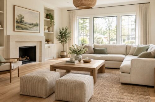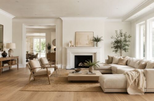
Swiss Coffee by Sherwin Williams is a warm, creamy off-white with an LRV of 83 and soft yellow undertones. It is not the same color as Benjamin Moore Swiss Coffee, the two brands share a name but differ in formula, undertones, and finish. The closest Sherwin Williams match to Benjamin Moore Swiss Coffee is Alabaster (SW 7008), which shares a near-identical LRV of 82 and a similarly soft, warm base.
If you’ve been searching for a paint color that feels warm without looking yellow, cozy without feeling heavy, and timeless without being boring, Swiss Coffee Sherwin Williams has likely landed on your shortlist. And for good reason. This creamy off-white has spent years as one of the most searched-for neutral paint colors in North America, and in 2026, it shows no signs of fading.
But here’s where most homeowners get tripped up: there is more than one “Swiss Coffee” on the market, and not all of them are the same color. Sherwin Williams has its own version. Benjamin Moore has its own beloved classic. Behr, Valspar, and Kilz all carry the same name, and they all look different on your wall.
This guide cuts through the confusion. Whether you want to know the exact LRV, understand the undertones, find the best Sherwin Williams equivalent to Benjamin Moore’s version, or simply figure out which colors to pair it with, you will find clear, data-backed answers below.
What Is Swiss Coffee by Sherwin Williams?
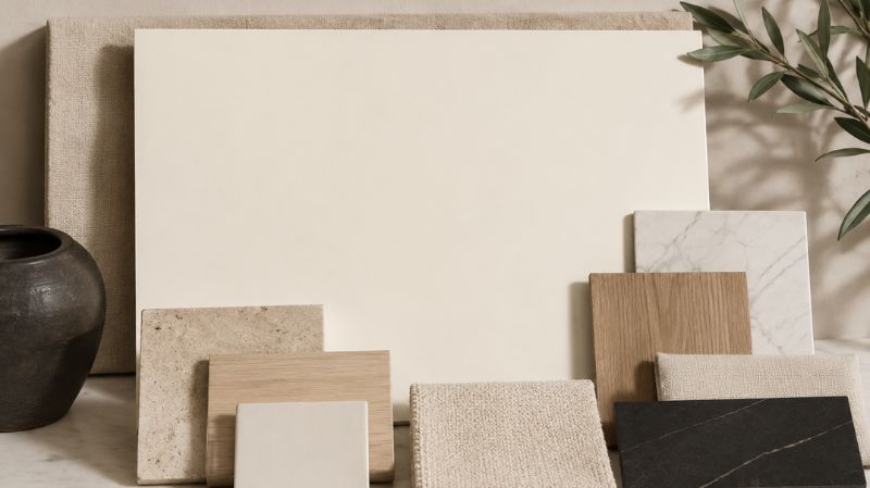
What Are the Exact Color Specs for Sherwin Williams Swiss Coffee?
Sherwin Williams Swiss Coffee is a warm, soft white paint color. It sits comfortably in the off-white category, lighter than a classic cream, richer than a pure white, and far more interesting than a plain beige.
Here are the full technical specifications:
| Property | Value |
| Color Name | Swiss Coffee |
| LRV (Light Reflectance Value) | 83 |
| Undertones | Warm yellow with subtle beige |
| Color Family | Off-White / Warm White |
| Finish Options | Flat, Eggshell, Satin, Semi-Gloss |
| Best Use | Walls, ceilings, trim, cabinetry |
The LRV of 83 places Swiss Coffee firmly in the “light” category. For reference, pure white sits around 90–92 on the LRV scale, and mid-range beiges typically fall between 50 and 65. At 83, Swiss Coffee is bright enough to open up a room while still carrying enough warmth to feel lived-in and genuinely human.
Is Swiss Coffee a Warm or Cool Color?
Swiss Coffee is unambiguously warm. Its dominant undertones are yellow with a hint of beige, which means it leans toward the golden, cozy end of the white spectrum rather than the crisp, cool end.
That warmth is precisely what makes it so universally appealing. Cool whites can look sharp and clean in a brightly lit modern space, but they can also read as cold or clinical, especially in rooms without abundant natural light. Swiss Coffee solves that problem by adding just enough warmth to feel welcoming without ever tipping into “too yellow” territory.
Is Sherwin Williams Swiss Coffee the Same as Benjamin Moore Swiss Coffee?
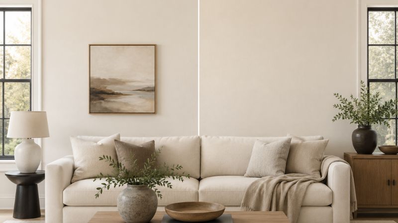
What Is the Difference Between SW and BM Swiss Coffee?
This is the single most common point of confusion, and it matters enormously before you walk into a paint store.
They are not the same color. The name “Swiss Coffee” is used by multiple paint brands, but each brand formulates its own version using its own pigment base and proprietary chemistry. The result is that even colors sharing an identical name can look noticeably different on a wall.
Here is how the two most popular versions compare:
| Feature | SW Swiss Coffee | BM Swiss Coffee (OC-45) |
| LRV | 83 | ~82–83.93 |
| Undertones | Yellow-warm | Subtle green-gray with warmth |
| Feel on Wall | Slightly creamier, golden | Softer, more neutral, barely perceptible warmth |
| Chroma (Color Intensity) | Higher — reads warmer | Lower — reads slightly brighter/cleaner |
| Best Described As | Warm, creamy off-white | Soft, nearly neutral warm white |
The practical upshot: if you paint a room in SW Swiss Coffee and compare it side-by-side with BM Swiss Coffee, you will notice that the Sherwin Williams version reads slightly more cream-yellow, while the Benjamin Moore version appears a touch more neutral and bright. Both are beautiful. They just aren’t interchangeable.
A note on cross-brand matching: Paint manufacturers use different bases and colorants, so creating a perfect match between brands is effectively impossible. A Sherwin Williams store can scan a Benjamin Moore chip and try to replicate the formula, but the result will always be an approximation, especially with neutrals, where small differences in undertones become highly visible across large surfaces.
What Is the LRV of Swiss Coffee Sherwin Williams — and Why Does It Matter?
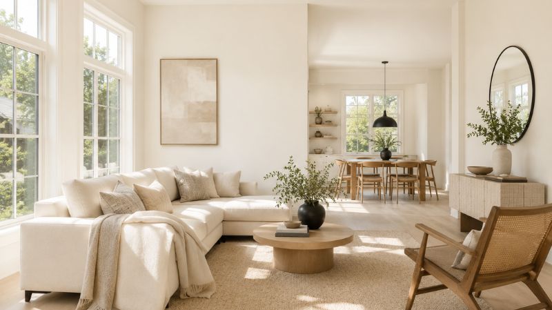
How Does LRV Affect Paint Color in a Real Room?
LRV stands for Light Reflectance Value. It is a standardized number between 0 (absolute black, reflects no light) and 100 (pure white, reflects all light). The higher the LRV, the more light a color reflects back into the room, and the brighter the space feels.
Swiss Coffee Sherwin Williams has an LRV of 83, which puts it in a sweet spot that most interior designers consider ideal for versatile, room-brightening neutrals.
Here is what that number means in practical terms:
- In a north-facing room: The warmth in Swiss Coffee fights off the cool, bluish light that typically floods north-facing spaces, making the room feel far more welcoming than a cool white would.
- In a small room: An LRV of 83 reflects a substantial amount of light, helping the space feel larger and more open without the harshness of a stark white.
- In a large, open-plan space: Swiss Coffee creates an airy backdrop that prevents the room from feeling sterile or cold, especially under warm artificial lighting in the evenings.
- Under different light sources: LED daylight bulbs will bring out more of the crisp, clean side of Swiss Coffee. Warm incandescent or soft-white LEDs will enhance the golden, creamy quality.
How Does Swiss Coffee Change Throughout the Day?
One of the most charming qualities of Swiss Coffee paint color is its responsiveness to light. Unlike flat, unchanging neutrals, this color has a living quality that shifts as the sun moves.
In the morning, direct sunlight makes it appear brighter, pulling out the lighter, almost airy side of its character. By mid-afternoon, it settles into a softer, more muted tone, a little more beige, a little less bright. In the evening, under warm lamps, it picks up a genuinely golden glow that makes a room feel intimate and comfortable. This is a color that rewards you no matter what time of day it is.
What Are the Undertones in Swiss Coffee Sherwin Williams?
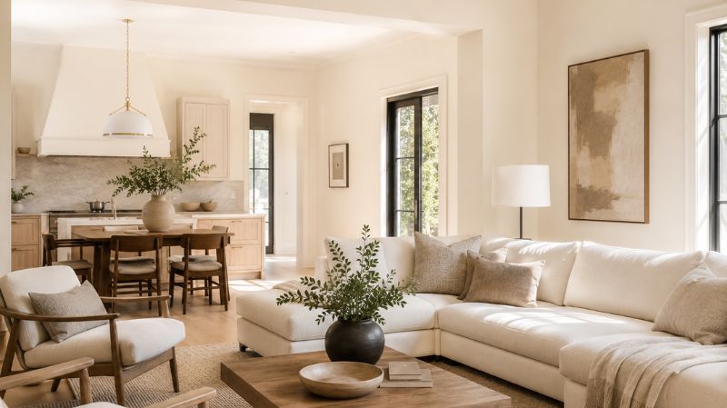
Does Swiss Coffee Look Yellow on the Wall?
This is one of the most searched questions about this color, and the answer requires a bit of nuance.
Swiss Coffee Sherwin Williams does have yellow undertones. However, whether it reads as yellow on your wall depends heavily on your lighting conditions and your surrounding finishes.
In rooms with cool-toned gray flooring, cool white trim, or significant north-facing light, the yellow undertone in Swiss Coffee can become more noticeable. In those conditions, the contrast between the wall color and the cooler surrounding elements causes the yellow to pop forward.
In rooms with warm wood floors, warm-toned trim, or south- and west-facing light, the yellow undertone blends naturally with the rest of the palette and simply reads as “warm white.”
The rule of thumb: If your home already has a lot of cool-toned elements (gray tile, white oak with a gray stain, cool-toned stone countertops), test Swiss Coffee on a large sample before committing. In warmer homes — honey oak, walnut, warm stone — it is almost universally flattering.
How Do the Undertones Compare to Other Popular SW Whites?
| Color | Undertones | LRV | Looks Like |
| Swiss Coffee (SW) | Yellow-warm | 83 | Creamy, golden warm white |
| Alabaster (SW 7008) | Yellow with beige | 82 | Slightly cooler warm white |
| Greek Villa (SW 7551) | Yellow-cream | 84 | Brighter, crisper warm white |
| Pure White (SW 7005) | Near-neutral, slight warm | 84 | Clean, modern near-white |
| Shoji White (SW 7042) | Green-gray | 74 | Deeper, muted greige-white |
| Snowbound (SW 7004) | Blue-gray tint | 83 | Crisp, slightly cool white |
What Is the Best Sherwin Williams Match for Benjamin Moore Swiss Coffee?
Which SW Color Is Closest to BM Swiss Coffee (OC-45)?
This is the question that brings most people to this article, and it deserves a clear, ranked answer.
When searching for the closest Sherwin Williams equivalent to Benjamin Moore Swiss Coffee, Alabaster (SW 7008) is widely recognized as the strongest match. It shares a near-identical LRV of 82, carries a similar soft, warm-white character, and reads comparably on walls across different lighting conditions.
However, there are a handful of other strong candidates worth testing, and the best choice depends on your specific room and finishes:
1. Alabaster (SW 7008) — Best Overall Match
LRV: 82. Undertones: yellow with subtle beige. Alabaster is often described as a warm, creamy white that feels inviting without being heavy. It is arguably the most popular neutral white in the Sherwin Williams lineup and performs most consistently across room types. The main difference from BM Swiss Coffee: Alabaster leans slightly more yellow, while BM Swiss Coffee has subtle green-gray notes that make it appear marginally more neutral.
2. Shell White (SW 8917) — Closest in Neutrality
Shell White mirrors the softer, less distinctly creamy quality of BM Swiss Coffee. It has a slightly lower saturation than Alabaster, which means it reads very clean on the wall without feeling stark. A strong pick if BM Swiss Coffee appeals to you precisely because it doesn’t look “too warm.”
3. White Flour (SW) — Lightest Option
White Flour is slightly brighter than both BM Swiss Coffee and Alabaster but holds a comparable warmth. Experts who have tested Swiss Coffee paint color across brands note that White Flour comes closest to being a universal approximation — regardless of which brand’s version is the reference point. Best for rooms where you want maximum brightness without moving to a crisp, cool white.
4. Creamy (SW 7012) — For Warmer Applications
If you love the warm quality of Swiss Coffee but want something with slightly more depth and richness, Creamy is worth sampling. It reads warmer and richer — excellent for traditional or farmhouse-style kitchens and cabinetry.
5. White Duck (SW 7010) — For a Softer, Greige Lean
White Duck sits at the intersection of warm white and very pale greige. It has less visible creaminess than Alabaster, making it a good option if you want warmth without any risk of excess yellow.
Can Sherwin Williams custom-match BM Swiss Coffee?
Yes, most SW locations offer digital color scanning. Bring in a BM Swiss Coffee chip or a large painted sample and ask for a spectrophotometer match. The result will be a very close approximation, but not a perfect duplicate, because the brands use different base formulas. Always get a sample and test on your actual wall before committing to full gallons.
What Are the Best Coordinating Colors for Swiss Coffee Sherwin Williams?
Which Trim Colors Work Best with Swiss Coffee?
Trim color selection is one of the most important decisions when painting walls in Swiss Coffee. The wrong trim can either wash out the walls or create a jarring contrast.
Best trim pairings:
- Alabaster (SW 7008): A warm, tonal pairing that feels cohesive and refined. Since Alabaster is slightly lighter than Swiss Coffee walls, it creates a gentle distinction between wall and trim without any contrast clash.
- Pure White (SW 7005): A step up in brightness. This creates a crisper, more defined trim line — ideal if you want a slightly more contemporary feel while keeping the walls warm.
- Extra White (SW 7006): For a bolder contrast. This pairing emphasizes architectural details and works beautifully in traditional homes with substantial crown molding and door casings.
What to avoid: Very cool-toned whites — anything with noticeable blue or gray undertones — will clash with Swiss Coffee’s warmth. The walls will appear more yellow by comparison, and the trim will look dingy or off-white in an unflattering way.
What Accent and Bold Colors Complement Swiss Coffee?
The creamy warmth of Swiss Coffee Sherwin-Williams colors makes it an exceptionally accommodating backdrop for both bold and soft accent colors. Here are the pairings that consistently deliver:
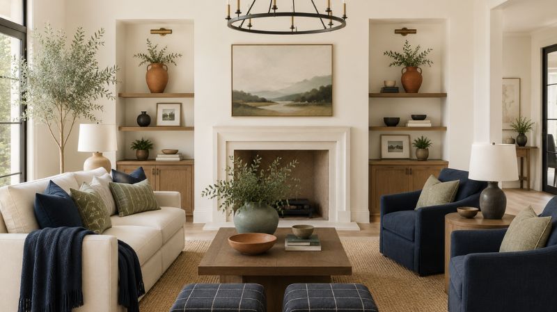
Deep Blues and Navies Nothing sets off a warm white wall like a rich navy or deep blue accent. Naval (SW 6244) or Hale Navy (BM HC-154) create a classic, timeless contrast with Swiss Coffee. This combination works particularly well in living rooms, home offices, and dining rooms.
Terracotta and Earthy Tones Cream and terracotta have a natural affinity — the warm, earthy quality of both colors puts them in the same visual family. Cavern Clay (SW 7701) is an excellent accent choice that feels contemporary and warm without overpowering the walls.
Charcoal and Near-Black For dramatic contrast, Tricorn Black (SW 6258) or Urbane Bronze (SW 7048) paired with Swiss Coffee walls creates a striking, sophisticated look. This works especially well on cabinetry, furniture, or a single accent wall in an otherwise Swiss Coffee room.
Soft Greens Muted, earthy greens in the sage-to-olive range complement the yellow undertones in Swiss Coffee by leaning into the natural palette. Avoid bright, saturated greens — they will fight with the creamy warmth.
What Flooring Works Best with Swiss Coffee Walls?
Flooring is often the element that makes or breaks a Swiss Coffee room.
Light wood floors (oak, maple, ash): One of the best pairings available. Light, warm-toned wood floors and Swiss Coffee walls create a bright, airy space that feels open but not cold. This combination works beautifully in Scandinavian, transitional, and coastal-inspired interiors.
Dark hardwood (walnut, ebony stain, dark oak): The contrast between rich dark floors and warm Swiss Coffee walls creates a layered, sophisticated look. The walls soften the heaviness of dark floors, and the floors ground what could otherwise be a very light space.
Natural stone and tile (travertine, limestone, warm porcelain): An excellent pairing for kitchens and bathrooms. The earthy, organic quality of natural stone in warm greige and taupe tones layers beautifully with Swiss Coffee paint color, creating a space that feels intentional and timeless.
Flooring to avoid: Cool gray-stained hardwood, blue-toned stone, and highly saturated red-toned cherry wood can all create tension with Swiss Coffee’s warmth. Cool-toned floors make the walls look more yellow; red-toned floors can make Swiss Coffee appear slightly pink.
Where Should You Use Swiss Coffee in Your Home?
Is Swiss Coffee Good for Living Rooms?
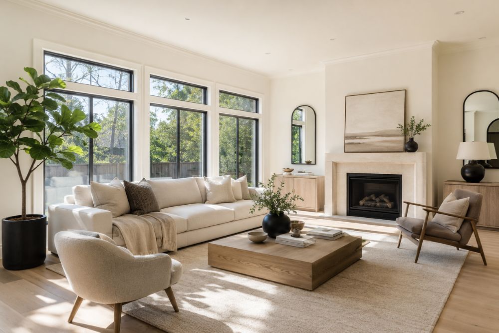
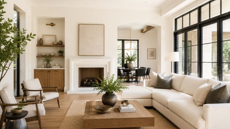
Yes, living rooms are one of the strongest applications for this color. In large, open spaces with good natural light, Swiss Coffee creates an airy, welcoming backdrop that never looks blank or cold. It recedes beautifully, letting furniture, art, and architectural details do the visual work.
In living rooms with less natural light, particularly north-facing rooms, the warm undertones in Swiss Coffee fight off the cold, bluish cast that typically makes those spaces feel uninviting. This is a color that earns its keep in difficult lighting situations.
Does Swiss Coffee Work on Kitchen Cabinets?
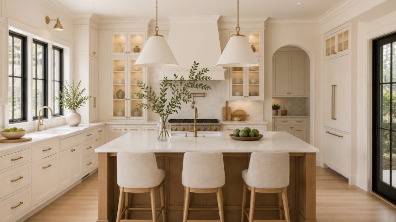
Absolutely. Swiss Coffee on kitchen cabinetry delivers a timeless, warm-white look that feels fresh without the clinical starkness of a bright white. It is particularly well suited to traditional, farmhouse, transitional, and classic contemporary kitchens.
One important note: if your kitchen has white appliances, particularly older models with a cool-white finish, be aware that Swiss Coffee’s warm undertones will create a visible contrast. The appliances may appear cold or off-white next to the cabinets. In kitchens with stainless steel, matte black, or integrated appliances, this issue disappears entirely.
Is Swiss Coffee a Good Bedroom Color?
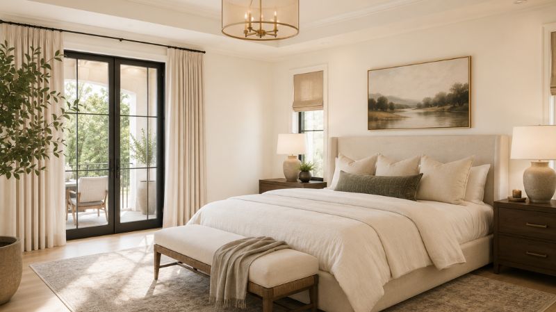
Swiss Coffee is an exceptional bedroom color. It is warm enough to feel cozy and restful, bright enough not to make the room feel small, and neutral enough to work with virtually any bedding, furniture, or textile palette.
Under evening lamp light, particularly with warm-toned bulbs, Swiss Coffee walls take on a genuinely golden quality that makes bedrooms feel intimate and safe. This is a color that improves with the falling of the light.
How Does Swiss Coffee Perform on Exterior Walls?
Swiss Coffee is a strong exterior paint choice for traditional, craftsman, farmhouse, and colonial-style architecture. It reads as a warm, sophisticated off-white on exterior surfaces and pairs well with deep charcoal or black trim for a classic high-contrast look, or warm bronze and natural wood tones for a softer, more enveloping approach.
On brick or stone homes, Swiss Coffee siding or trim complements warm-toned masonry naturally and avoids the stark contrast that brighter whites can create against aged brick.
Swiss Coffee vs. Other Popular Sherwin Williams White Paint Colors
How Does Swiss Coffee Compare to Alabaster, Greek Villa, and Pure White?
| Feature | Swiss Coffee (SW) | Alabaster (SW 7008) | Greek Villa (SW 7551) | Pure White (SW 7005) |
| LRV | 83 | 82 | 84 | 84 |
| Undertones | Yellow-warm | Yellow with beige | Yellow-cream | Near-neutral, very slight warm |
| Warmth Level | High | Medium-High | High | Low-Medium |
| Best Room Type | Living rooms, bedrooms | Any room | Kitchens, great rooms | Modern/minimalist spaces |
| On Cabinets | Yes | Yes | Yes | Yes |
| Best With Cool Floors | Test first | Better | Test first | Handles well |
Swiss Coffee vs. Alabaster: The two are close, but Swiss Coffee leans slightly more golden-yellow, while Alabaster carries more beige. Both have essentially the same LRV, so the difference is subtle — mostly visible in direct side-by-side comparison or under specific lighting conditions.
Swiss Coffee vs. Greek Villa: Greek Villa has a marginally higher LRV (84 vs. 83) and a purer, more distinctly yellow-cream tone. Swiss Coffee is slightly more neutral overall. If you want the warmest, creamiest look possible, Greek Villa edges ahead. If you want warmth with a touch more restraint, Swiss Coffee wins.
Swiss Coffee vs. Pure White: These are quite different in practice. Pure White is a clean, modern near-neutral that works well in contemporary spaces where you want a bright, fresh look. Swiss Coffee is warmer, cozier, and more forgiving — better for traditional and transitional spaces, and far more comfortable in rooms with limited natural light.
Life Example: One Designer’s Swiss Coffee Success Story
To illustrate how this color behaves in the real world, consider a project completed in late 2024 by a Texas-based interior designer working on a complete whole-home repaint.
The home was a 1990s-era craftsman in Austin — north-facing living room, medium-stained oak floors throughout, and an eclectic mix of furniture styles: traditional pieces in the living room, mid-century modern in the dining room, and contemporary furnishings in the master bedroom. The designer chose Swiss Coffee Sherwin Williams for every wall in the home — a bold, single-color approach.
The result? The color worked seamlessly in every room. In the north-facing living room, it countered the cool light and made the space feel genuinely warm. Against the medium-stained oak floors, it complemented rather than competed. In the mid-century dining room with walnut furniture, the warm walls created a rich, layered backdrop. In the contemporary bedroom, with crisp white bedding and brushed nickel fixtures, it provided just enough warmth to prevent the space from feeling stark.
The homeowner later noted that years after the project, the color still felt current and comfortable — exactly the quality that separates a truly great neutral from a trendy one.
Practical Tips Before You Buy Swiss Coffee Paint
How Do You Test Swiss Coffee Before Committing?
Always, always test paint on your actual walls before purchasing full gallons. This cannot be overstated.
Paint chips at the store are photographed, printed, and lit under fluorescent store lighting — none of which reflect what a color looks like in your specific home, under your specific lighting, next to your specific floors and furniture.
The right way to test Swiss Coffee undertones and all:
- Purchase a sample pot or a peel-and-stick paint sample.
- Apply a large swatch — at least 12 inches by 12 inches — directly on the wall you plan to paint.
- Observe it at multiple times: morning natural daylight, midday, late afternoon, and evening under your artificial lights.
- Compare it against your trim, flooring, and major furniture pieces.
- Only then decide.
What Paint Finish Should You Use for Swiss Coffee?
The right finish depends on the application:
- Walls: Flat or Eggshell. Flat hides surface imperfections beautifully and gives a soft, matte result. Eggshell adds a very subtle sheen that makes walls easier to wipe clean — ideal for high-traffic areas or homes with children.
- Trim and Doors: Satin or Semi-Gloss. These finishes are more durable, easier to clean, and help trim stand out gently against flat-finish walls.
- Cabinets: Satin or Semi-Gloss. Cabinets need a harder, more cleanable finish than walls.
- Ceilings: Flat ceiling finish. Swiss Coffee on ceilings works beautifully in spaces where you want a warm, cohesive envelope — particularly dining rooms and bedrooms.
How Many Coats Does Swiss Coffee Require?
For most applications over a properly primed white or light-colored surface, two coats of Swiss Coffee will achieve full, even coverage. If you are painting over a dark color, prime first — skipping primer when transitioning from dark to light will result in bleed-through that no amount of topcoats will fully correct.
Conclusion
Swiss Coffee Sherwin Williams is one of those rare paint colors that genuinely deserves its reputation. It occupies a small but critical sweet spot on the color spectrum — warm enough to feel welcoming, light enough to brighten a room, and neutral enough to work with almost any style of furnishing and decor.
It excels in north-facing rooms, open living spaces, traditional kitchens, and cozy bedrooms. It pairs beautifully with warm wood tones, brass and gold hardware, and both light and dark flooring. And it is timeless in the truest sense — not because it is boring, but because it is honest. A color this well-calibrated doesn’t age; it matures gracefully.
If you have been looking for a warm white that can anchor an entire home without ever calling attention to itself, Swiss Coffee deserves a place on your sample board. Just remember: test it on your actual walls, in your actual light, before you commit. No review can substitute for seeing how a color behaves in your specific space.
Order sample pots of Swiss Coffee alongside Alabaster (SW 7008) and Shell White (SW 8917) and compare them side by side. Pin them next to your trim, flooring, and largest furniture piece, and watch how they shift through a full day. Trust what your eyes tell you — your space, your lighting, and your taste are the final authority.
Frequently Asked Questions
1. Is there a Sherwin Williams color called Swiss Coffee?
Yes. Sherwin Williams does produce a paint color called Swiss Coffee. However, it is not the same formulation as Benjamin Moore’s Swiss Coffee (OC-45), which is the more widely referenced version of the name. The two brands use different pigment bases and colorants, resulting in colors that share a name but differ in undertone character and on-wall appearance.
2. What is the LRV of Swiss Coffee Sherwin Williams?
Sherwin Williams Swiss Coffee has a Light Reflectance Value (LRV) of 83. This places it in the light end of the color spectrum — bright enough to open up a space, but not so high that it loses its warm, creamy character. For comparison, Benjamin Moore’s Swiss Coffee (OC-45) has an LRV of approximately 82 to 83.93 depending on the measurement source.
3. What is the closest Sherwin Williams color to Benjamin Moore Swiss Coffee?
The closest Sherwin Williams match to Benjamin Moore Swiss Coffee (OC-45) is Alabaster (SW 7008). Both colors have a near-identical LRV (82 for Alabaster, approximately 82–83 for BM Swiss Coffee), and both read as soft, warm whites. Other strong alternatives include Shell White (SW 8917), White Flour, and White Duck (SW 7010). No match between brands is exact, so sampling is always recommended.
4. Does Swiss Coffee look yellow on walls?
Swiss Coffee Sherwin Williams can appear more yellow in rooms with cool-toned surroundings — such as gray flooring, cool white trim, or north-facing light — because the contrast amplifies its warm undertone. In rooms with warm wood floors, warm lighting, or warm-toned finishes, it reads as a natural, inviting warm white without looking overly yellow. Testing a large sample in your specific room is the only reliable way to evaluate this.
5. What colors go well with Swiss Coffee Sherwin Williams?
Swiss Coffee pairs beautifully with deep navy blues (Naval SW 6244), terracotta and earthy tones (Cavern Clay SW 7701), warm charcoals and near-blacks (Tricorn Black SW 6258, Urbane Bronze SW 7048), and muted sage or olive greens. For trim, Alabaster (SW 7008), Pure White (SW 7005), or Extra White (SW 7006) all work well depending on how much contrast you want between walls and trim.
6. Is Swiss Coffee good for kitchen cabinets?
Yes — Swiss Coffee is an excellent choice for kitchen cabinetry. It delivers a warm, timeless off-white look that works across traditional, farmhouse, transitional, and classic contemporary kitchens. Pair it with warm-toned countertops such as marble, quartz, or butcher block for the best result. Be aware that very cool-toned white appliances may contrast noticeably against Swiss Coffee cabinets.
7. Is Swiss Coffee the same as Alabaster by Sherwin Williams?
No. Swiss Coffee and Alabaster are two distinct Sherwin Williams colors. Alabaster (SW 7008) has an LRV of 82, while Swiss Coffee has an LRV of 83. Both are warm whites, but Alabaster carries stronger yellow undertones, while Swiss Coffee may appear slightly more neutral depending on lighting. In a direct side-by-side comparison, Alabaster reads as marginally warmer and creamier.
8. What is the best finish for Swiss Coffee on walls?
For walls, a flat finish gives Swiss Coffee the softest, most even appearance and hides surface imperfections well. Eggshell is preferred for rooms where washability matters — such as hallways, family rooms, and children’s rooms — as it adds a very slight sheen without meaningfully changing the color’s warmth. For trim and cabinetry, use satin or semi-gloss for durability and ease of cleaning.
9. Can Swiss Coffee be used on a home’s exterior?
Yes. Swiss Coffee is a strong exterior paint choice for traditional, craftsman, farmhouse, and colonial-style homes. It reads as a warm, sophisticated off-white on exterior surfaces and pairs well with deep charcoal or black trim for a classic look, or warm bronze and natural wood tones for a softer approach. It works particularly well alongside warm-toned brick and natural stone.
10. How does Swiss Coffee Sherwin Williams compare to Greek Villa (SW 7551)?
Both are warm whites, but they differ in undertone intensity. Greek Villa (SW 7551) has an LRV of 84 and a purer, more distinctly yellow-cream tone that reads as brighter and slightly crisper on the wall. Swiss Coffee has an LRV of 83 and sits a touch more neutral, making it a better option when you want warmth with a degree of restraint. Benjamin Moore Swiss Coffee, by contrast, has subtle green-gray undertones that make it appear even more neutral than the Sherwin Williams version.