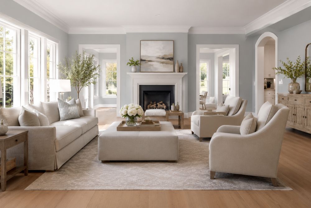
Sherwin Williams Upward (SW 6239) is a soft, airy blue-gray paint color with an LRV of 57, meaning it reflects a moderate-to-high amount of light. Its undertones lean cool gray-blue in most lighting, with subtle violet tones appearing in north and east-facing rooms. It works best in bedrooms, bathrooms, kitchens, and living rooms, and pairs beautifully with Pure White, Extra White, and Naval.
If you only had ten seconds to learn about this color, that paragraph above would cover it. But Upward deserves more than ten seconds, it’s one of the most talked-about blues in Sherwin Williams’ lineup, and understanding why it works the way it does will save you from a costly repaint.
As someone who has spent years writing about and researching paint colors for homeowners, I can tell you that Upward earns its reputation. It’s not flashy. It’s not trendy in a way that will date quickly. It’s the kind of color that quietly does its job, and does it well, in almost any room you put it in.
Let’s break down exactly what makes Upward tick, where it shines, and where it might not be the right fit.
What Is Sherwin Williams Upward SW 6239?
Sherwin Williams Upward SW 6239 is a light, cool-toned blue-gray with a hex value of approximately #BFC9D0. It belongs to the same family as colors like Sea Salt and Rainwashed, but Upward sits firmly on the blue side of that family rather than the green side.
It was part of Sherwin Williams’ Colormix Forecast collections and has become a favorite among designers for its restrained, calming character. Unlike louder blues that scream “coastal theme,” Upward whispers it.
Here’s a quick snapshot of its core specs:
- Color family: Blue-gray (cool)
- LRV (Light Reflectance Value): 57
- Hex code: #BFC9D0
- Undertone: Gray with subtle violet/blue
- Sheen recommendations: Eggshell (walls), Satin (bathrooms), Semi-gloss (trim)
This balance of numbers matters more than it might seem. An LRV of 57 sits right in the “Goldilocks zone”, light enough to brighten a room, but not so light that it washes out or shows every smudge like a true white would.
Reviewing Sherwin Williams Upward: First Impressions
When reviewing Sherwin Williams Upward, the first thing most people notice is how calm it feels on the wall. It doesn’t compete with your furniture or your art. It sits back and lets everything else in the room do the talking, while quietly tying it all together.
In direct comparisons with similar Sherwin Williams blues, like Windy Blue (SW 6228) or Sleepy Blue (SW 6225), Upward consistently comes across as the most “neutral” of the bunch. It reads less like “a blue room” and more like “a calm, light-filled room that happens to have a hint of blue in it.”
That distinction is exactly why so many homeowners choose Upward when they want color without commitment. It gives you the benefit of a tinted wall, depth, warmth, interest, without locking you into a strict color scheme for your furniture, art, or textiles down the road.
What Makes Sherwin Williams Upward Unique?
What makes Sherwin Williams Upward unique isn’t one single feature, it’s the combination of three things working together: its undertone balance, its light-reflectance behavior, and its unusual versatility across design styles.
Is Upward Blue or Gray?
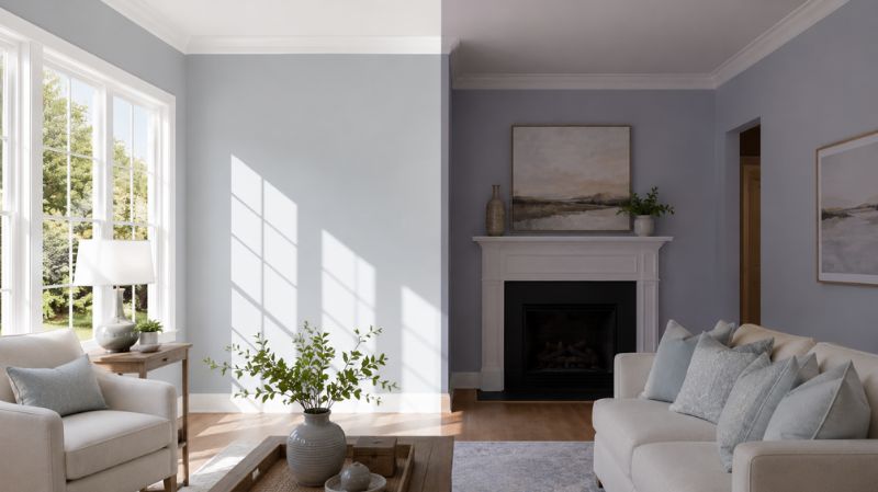
Technically, Upward is classified as a blue-gray, but in real rooms it tends to read closer to gray with a blue cast. Think of it like a foggy morning sky rather than a clear afternoon one.
Color databases list its undertones as primarily cool gray with a hint of violet. That violet hint is subtle, most people won’t consciously notice it, but it’s part of why Upward can occasionally look slightly purple-gray in dim, north-facing rooms.
In simple terms:
- In bright light: Upward leans blue and fresh
- In low or warm artificial light: Upward leans gray and muted
- In north-facing rooms: Upward can show a faint violet-gray cast
- In south-facing rooms: Upward appears lighter and more blue-forward
How Does Upward’s LRV Affect a Room?
An LRV of 57 means Upward reflects a little over half the light that hits it. For context, pure white sits near 100, and pure black sits near 0. Most “mid-tone” wall colors fall between 40 and 65 — so Upward is comfortably in that mid-tone range, leaning toward the lighter side.
Practically, this means:
- Small rooms won’t feel boxed in
- Large rooms won’t feel cold or sterile
- The color will shift noticeably between morning and evening light
- It photographs well for listings, blogs, and social media (a detail that matters more than people think, more on that below)
Why Designers Call Upward “The Diplomat” of Blues
Among professional painters and interior designers, Upward has earned a nickname for being remarkably easy to work with. It plays well with warm wood tones, cool marble, brushed nickel, matte black, and oil-rubbed bronze, a rare trait for a color with any blue in it at all.
Most blues force you to commit to either a “warm” or “cool” overall palette. Upward doesn’t. It sits in the middle, acting almost like a translator between warm and cool elements in the same room.
Where to Use Sherwin Williams Upward?
This is the question most homeowners actually care about, so let’s get specific. Knowing where to use Sherwin Williams Upward comes down to understanding two things: how much natural light a room gets, and what mood you want that room to have.
Is Upward Good for Bedrooms?
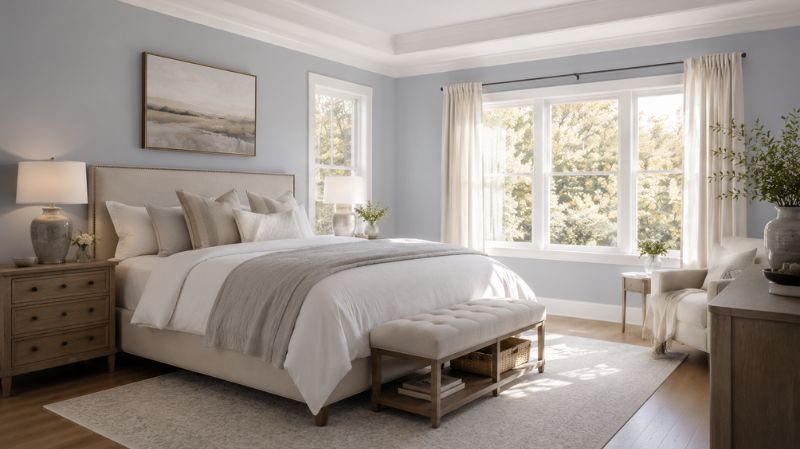
Yes, bedrooms are arguably where Upward performs best. The color’s mid-range LRV keeps the room from feeling dark, while its cool undertone supports the calm, sleep-friendly atmosphere most people want in a bedroom.
A real-world example: a homeowner in a 1990s colonial repainted their primary bedroom, previously a builder-grade beige, in Upward with Pure White trim and ceiling. The room faced east, so mornings brought a soft, almost periwinkle glow, while evenings shifted the walls toward a deeper, more grounded gray-blue. The owners reported that the room “finally felt like a hotel” rather than a leftover space from the previous owners, a small but telling detail about how much undertone shifts can affect the feel of a room, not just its appearance.
Does Upward Work in Bathrooms?
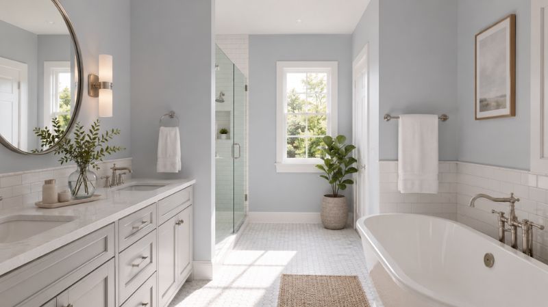
Bathrooms are another strong match. Paired with white subway tile, chrome or brushed nickel fixtures, and good lighting, Upward creates a spa-like atmosphere without leaning too far into “beachy” or “nautical” territory.
A few practical notes for bathroom use:
- Use Satin finish for moisture resistance
- Pair with white or light gray countertops to avoid a muddy look
- Avoid pairing with yellow-toned lighting if you want the blue to stay visible
Is Upward a Good Kitchen Color?
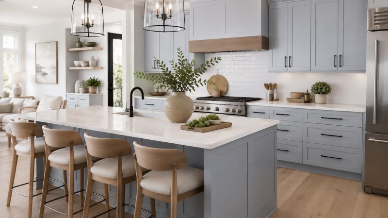
For kitchens, particularly cabinets, Upward has become a popular alternative to the now-ubiquitous all-white kitchen. Its medium-light LRV keeps kitchens feeling bright and open, while the gray undertone keeps it from looking like a child’s playroom.
It pairs especially well with:
- Brushed nickel or matte black hardware
- White quartz or marble countertops
- Natural wood open shelving
Can Upward Work in Living Rooms and Open-Concept Spaces?
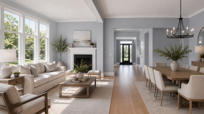
In larger, open-concept layouts, Upward tends to behave differently depending on where you’re standing. Near a window, it can look almost sky-blue. Across the room, in shadow, it can look gray. This isn’t a flaw, designers actually use this quality intentionally, because it gives a single-color room a sense of depth and movement that a flat, uniform color can’t achieve.
Where Should You Avoid Using Upward?
To be fair in this review, Upward isn’t the right choice for every situation:
- All-day shaded north-facing rooms with small windows can occasionally feel a bit flat or cool
- Spaces lit primarily by warm incandescent bulbs may dull the blue undertone more than expected
- Highly traditional, warm-toned interiors (think heavy reds, golds, and dark cherry wood) may clash slightly without careful balancing
If your space falls into one of these categories, it’s not a dealbreaker, but it does mean you should test a sample before committing to a full room.
How Does Light Direction Affect Sherwin Williams Upward?
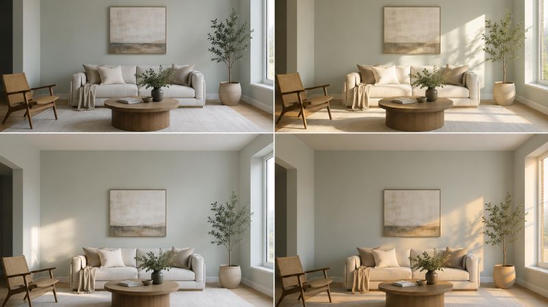
Light direction has more impact on Upward than almost any other single factor, which is why it deserves its own section.
| Room Direction | How Upward Appears | Best Time of Day to View |
| North-facing | Cooler, slightly gray-violet | Midday |
| South-facing | Brighter, more blue-forward | Morning to early afternoon |
| East-facing | Warm and soft in morning; cooler, violet-gray by evening | Morning |
| West-facing | Fresh, light blue-gray most of the day | Late afternoon |
This table is worth pinning to your fridge if you’re planning a repaint. The biggest mistake people make with any blue-gray paint, not just Upward, is choosing it based on a swatch held under store lighting, then being surprised when it looks completely different at home.
Quick Comparison: Sherwin Williams Upward vs. Similar Colors
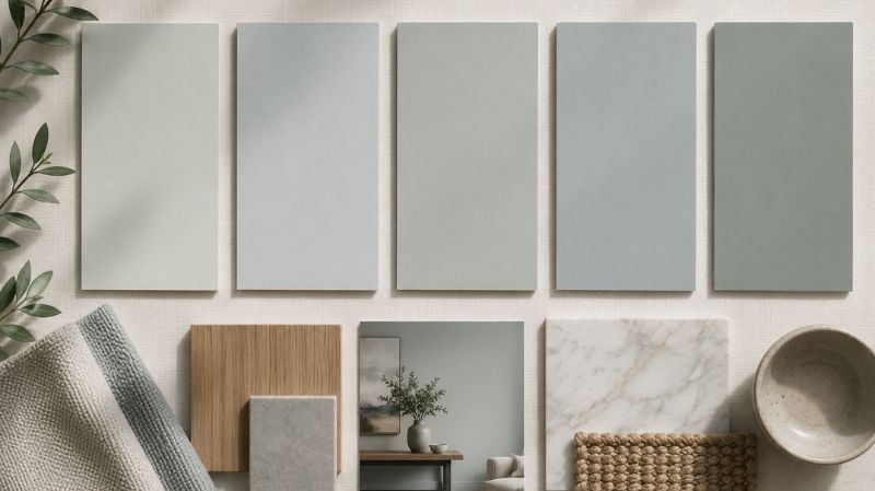
If you’re cross-shopping Upward against other popular blues and blue-grays, here’s how it stacks up:
| Color | LRV | Undertone | Best For | How It Differs From Upward |
| SW Upward (6239) | 57 | Cool gray-blue with violet hint | Bedrooms, baths, kitchens | — |
| SW Sea Salt (6204) | 63 | Green-gray | Living rooms, coastal spaces | Greener, softer, less blue-forward |
| SW Windy Blue (6228) | 48 | True blue-gray | Accent walls, bedrooms | Darker, more saturated blue |
| SW Quietude (6212) | 65 | Green-blue | Bathrooms, sunrooms | Stronger green undertone, mutes more in low light |
| SW Rainwashed (6211) | 61 | Soft green-blue | Living rooms, nurseries | Lighter, more green-leaning |
The takeaway: if Upward feels slightly too gray for your taste, Sea Salt or Rainwashed will push you toward green. If it feels too light, Windy Blue gives you the same family in a deeper shade.
Coordinating Colors with Sherwin Williams Upward
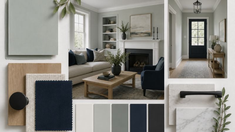
Choosing the right coordinating colors with Sherwin Williams Upward can make the difference between a room that feels “finished” and one that feels like it’s still missing something.
What Trim Color Works Best With Upward?
For trim, ceilings, and doors, two whites consistently come out on top:
- Pure White (SW 7005): Slightly warmer white, creates a soft, classic contrast
- Extra White (SW 7006): Crisper, brighter white, creates a more modern, high-contrast look
If you want your ceiling to disappear and make the room feel taller, a very light tint of Upward (roughly 50% strength) on the ceiling can create a soft “envelope” effect, though Ceiling Bright White (SW 7007) remains the safer, more traditional choice.
What Accent Colors Pair Well With Upward?
For accent walls, built-ins, or furniture, consider:
- Naval (SW 6244): A deep navy that creates dramatic, high-contrast pairings
- Tricorn Black (SW 6258): Works beautifully for window frames, hardware, and trim accents
- Distance (SW 6243): A softer, tonal pairing for a more monochromatic look
What Neutrals Complement Upward?
If you want Upward to feel grounded rather than purely “cool,” pair it with warmer neutrals:
- Agreeable Gray (SW 7029): Adds earthiness without fighting the blue
- Worldly Gray (SW 7043): A warm greige that bridges cool walls and warm furniture
- Kilim Beige (SW 6106): Useful in textiles and furnishings for added warmth
Does Upward Work With Wood Tones and Metal Finishes?
Yes, and this is part of what makes it so versatile:
- Light oak / driftwood floors: Enhances the airy, coastal feel
- Dark walnut or espresso floors: Creates a striking, grounded contrast
- Brushed nickel hardware: Modern, clean pairing
- Oil-rubbed bronze hardware: Adds warmth and traditional character
- Matte black hardware: Contemporary without feeling harsh
How to Test Sherwin Williams Upward Before You Commit
Because Upward shifts so much with lighting, testing it properly matters more than with most colors. Here’s the process worth following:
- Get a large sample — at least a 12×12 inch swatch, not a tiny chip
- Paint it on two or three different walls in the room, including one near the main light source
- View it at three times of day — morning, midday, and evening
- Check it under your actual light bulbs — LED bulbs will cool the color down; incandescent will warm it up
- Step back at least 6 feet — undertones are easier to spot from a distance than up close
Skipping this step is the single most common reason people end up repainting a “mistake” color within a year.
Final Thoughts
If you’re after a color that brings a touch of personality to a room without demanding a complete style overhaul, Sherwin Williams Upward SW 6239 is one of the safer, smarter bets in the blue-gray category. Its balanced LRV keeps rooms bright, its gray-violet undertone keeps it sophisticated rather than juvenile, and its flexibility across wood tones, metals, and design styles means it won’t box you into a corner later.
The main thing to remember is that Upward is a color that moves, it shifts with the light, the time of day, and the room’s orientation. That’s not a downside; it’s part of the appeal. But it does mean a proper sample test, in your actual space, under your actual lighting, is non-negotiable before you commit to gallons of paint.
Order a large sample swatch, tape it up in two or three spots around the room, and live with it for a few days before making your final call. And if you’ve already painted a space in Upward, share your experience in the comments, real photos and real lighting conditions help other readers more than any swatch ever could.
Frequently Asked Questions
Is Sherwin Williams Upward warm or cool?
Upward is a cool-toned color overall, with a gray-blue base and a subtle violet undertone. However, in bright natural light or paired with warm wood and brass accents, it can read slightly warmer than its base tone suggests. It’s best described as a “balanced cool” — cool enough to feel calming, but not so cool that it feels cold or sterile.
What is the LRV of Sherwin Williams Upward?
Sherwin Williams Upward has a Light Reflectance Value (LRV) of 57. This places it in the mid-to-light range on the 0–100 scale, meaning it reflects a moderate amount of light. Rooms painted in Upward will generally feel bright and open without the stark brightness of a true white.
Is Sherwin Williams Upward too blue for a whole house?
No. Because of its gray undertone and moderate LRV, Upward is subtle enough to use as a whole-house color without feeling overwhelming. Different rooms will show slightly different versions of the color depending on their light exposure, which actually helps each space feel distinct while maintaining a cohesive flow throughout the home.
Will Upward make a small room look darker?
Generally, no. With an LRV of 57, Upward reflects more light than it absorbs, which helps small rooms feel open rather than closed in. Small bathrooms, powder rooms, and nooks often benefit from Upward because it adds a touch of color without sacrificing brightness — especially when paired with white trim and good lighting.
What is the best trim color for Sherwin Williams Upward?
Pure White (SW 7005) and Extra White (SW 7006) are the two most popular trim pairings for Upward. Pure White offers a slightly softer, warmer contrast, while Extra White creates a crisper, more modern look. Both options keep the focus on Upward’s subtle undertones rather than competing with them.
Does Sherwin Williams Upward look different in different lighting?
Yes, significantly. In bright natural daylight, Upward leans more blue and fresh. Under warm incandescent bulbs, it shifts toward a muted gray. Under cool LED lighting, the gray-violet undertones become more noticeable. This sensitivity to light is normal for most blue-gray paints and is part of what gives Upward its dynamic, “alive” quality throughout the day.
Is Sherwin Williams Upward good for exteriors?
Yes, Upward works well on exteriors, particularly on front doors, shutters, and full siding for coastal, modern, or transitional homes. In direct sunlight, it can appear lighter and more washed out than the interior swatch suggests, so it’s worth testing a sample on the actual exterior surface before committing to a full application.
How does Sherwin Williams Upward compare to Sea Salt?
Upward and Sea Salt are often compared because both belong to Sherwin Williams’ popular “Coastal Cool” palette family. The key difference is undertone: Upward leans blue-gray with a violet hint, while Sea Salt leans green-gray. Sea Salt also has a slightly higher LRV (63 vs. 57), making it marginally lighter and softer in most rooms.
What sheen should I use for Sherwin Williams Upward?
For walls in living areas and bedrooms, eggshell is generally recommended because it balances durability with a soft, non-reflective look that flatters Upward’s subtle undertones. In bathrooms or kitchens, satin offers better moisture resistance. For trim and doors, semi-gloss creates a clean contrast against Upward’s matte wall finish.
Is Sherwin Williams Upward still a popular color choice?
Yes. Upward has remained one of Sherwin Williams’ most consistently recommended blue-grays among designers and painters, in part because of its versatility across design styles, from coastal and farmhouse to modern and transitional. Its balanced undertone and mid-range LRV mean it doesn’t read as “trendy” in the way bolder, more saturated colors can, which has helped it maintain steady popularity rather than fading quickly.


