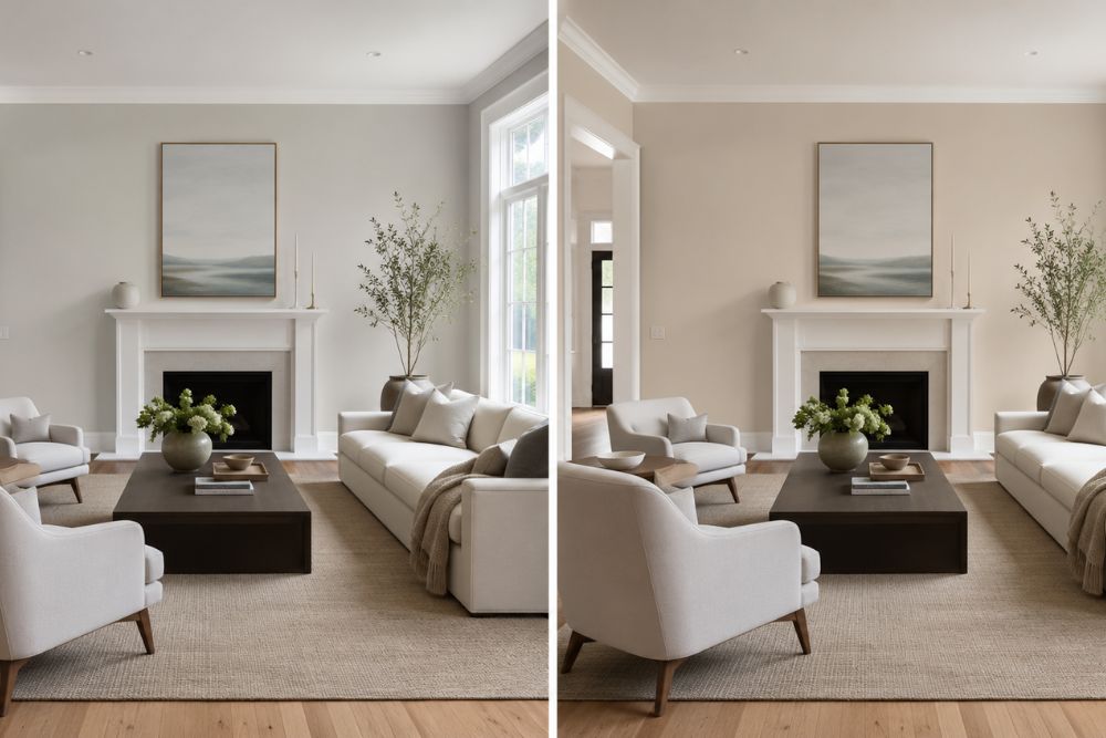
If you’re choosing between Benjamin Moore Edgecomb Gray vs Accessible Beige, both are excellent warm neutral paint colors, but they create different moods. Edgecomb Gray (HC-173) is lighter, softer, and slightly grayer, making it ideal for bright, airy interiors. Sherwin-Williams Accessible Beige (SW 7036) is warmer, richer, and more grounded, making it perfect for cozy, inviting spaces. The better choice depends on your home’s lighting, décor, flooring, and overall interior design style.
For homeowners seeking a versatile whole-house paint color, Edgecomb Gray generally works better in homes with abundant natural light and modern décor, while Accessible Beige complements traditional, farmhouse, and warm contemporary interiors.
Comparison Table: Edgecomb Gray vs Accessible Beige
| Feature | Benjamin Moore Edgecomb Gray (HC-173) | Sherwin-Williams Accessible Beige (SW 7036) |
| Paint Brand | Benjamin Moore | Sherwin-Williams |
| Color Family | Warm Greige | Warm Beige Greige |
| LRV | 63.09 | 58 |
| Undertones | Soft gray, beige, slight green | Beige, taupe, subtle gray |
| Warm or Cool | Warm | Warm |
| Brightness | Lighter | Slightly darker |
| Best For | Whole-house paint, open layouts | Cozy interiors, traditional homes |
| Best Trim Colors | White Dove, Chantilly Lace | Pure White, Alabaster |
| Ideal Rooms | Living rooms, kitchens, bedrooms | Family rooms, dining rooms, bedrooms |
| Interior Style | Modern, Scandinavian, Coastal | Farmhouse, Transitional, Traditional |
| Exterior Use | Excellent | Excellent |
Why These Two Paint Colors Are Among the Most Popular Neutral Choices
Neutral paint colors have become the foundation of modern interior design because they create timeless spaces that adapt to changing furniture, décor, and lifestyle trends. Rather than dominating a room, quality neutrals provide a balanced backdrop that highlights architecture, artwork, textiles, and natural materials.
Both Benjamin Moore Edgecomb Gray and Sherwin-Williams Accessible Beige have earned a reputation among interior designers for their versatility. They belong to the greige family—a blend of gray and beige—which offers more depth than plain white while remaining flexible enough for almost any residential application.
From a home improvement perspective, these colors also enhance resale appeal. Real estate professionals frequently recommend soft neutrals because they help buyers imagine their own furniture and décor in the space.
What Is Benjamin Moore Edgecomb Gray?
Why Is Edgecomb Gray So Popular?
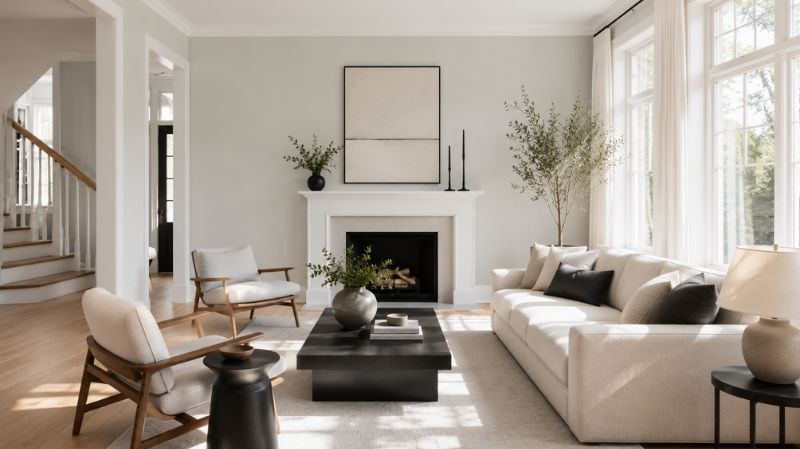
Benjamin Moore Edgecomb Gray (HC-173) is often described as one of the most versatile greige paint colors available. Despite its name, it isn’t a true gray. Instead, it blends warm beige with soft gray undertones to create a balanced, welcoming color.
With an LRV (Light Reflectance Value) of approximately 63, Edgecomb Gray reflects a significant amount of light, making rooms feel larger and brighter. It belongs to the Benjamin Moore Historical Collection, known for timeless colors that remain stylish year after year.
Because of its balanced warmth, Edgecomb Gray works beautifully in:
- Modern homes
- Transitional interiors
- Coastal homes
- Scandinavian designs
- Minimalist spaces
- Open-concept floor plans
Unlike many gray paints that can appear cold, Edgecomb Gray maintains warmth without feeling overly creamy or yellow.
What Undertones Does Edgecomb Gray Have?
The beauty of Edgecomb Gray lies in its subtle undertones.
Depending on lighting, it may reveal:
- Soft beige
- Gentle gray
- Slight green undertones
- A hint of taupe
The green undertone is usually very subtle and only noticeable in shaded rooms or when paired with cooler finishes.
This balanced undertone makes Edgecomb Gray adaptable to a wide range of flooring, cabinetry, and furniture colors.
How Does Edgecomb Gray Change Throughout the Day?
Lighting dramatically affects paint colors, and Edgecomb Gray is no exception.
Morning (East-facing rooms):
- Soft
- Fresh
- Light greige appearance
Afternoon (West-facing rooms):
- Warmer
- Creamier
- More beige than gray
South-facing rooms:
- Bright
- Balanced
- Neutral throughout the day
North-facing rooms:
- Slightly cooler
- Gray undertones become more noticeable
- Still retains warmth compared to cool grays
This adaptability explains why many designers recommend it as a reliable whole-house paint color.
What Is Sherwin-Williams Accessible Beige?
Why Has Accessible Beige Become a Designer Favorite?
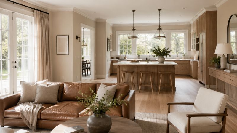
Sherwin-Williams Accessible Beige (SW 7036) is one of the company’s best-selling neutral paint colors. Although it’s called “Accessible Beige,” it isn’t a traditional beige. Instead, it’s a sophisticated greige with warm taupe influences.
Its LRV of 58 means it reflects slightly less light than Edgecomb Gray, giving it a richer and cozier appearance.
Accessible Beige performs exceptionally well in homes featuring:
- Natural wood finishes
- Warm hardwood flooring
- Stone fireplaces
- Organic modern décor
- Farmhouse interiors
- Rustic design styles
It creates comfortable spaces without feeling dark or heavy.
What Undertones Does Accessible Beige Have?
Accessible Beige contains:
- Warm beige undertones
- Light gray influence
- Subtle taupe
- Minimal green
Compared to Edgecomb Gray, Accessible Beige feels noticeably warmer and earthier.
It rarely appears yellow, making it an excellent alternative to older beige paint colors that can look dated.
How Does Accessible Beige Look Throughout the Day?
Because it contains more warmth, Accessible Beige behaves differently under changing light.
Morning:
- Soft beige
- Relaxed appearance
Midday:
- Balanced warm greige
- Natural and inviting
Afternoon:
- Richer
- Slightly deeper
- Cozy feeling
Artificial lighting:
- Warm LEDs enhance its comfort.
- Cool LEDs introduce a touch more gray.
This makes Accessible Beige especially appealing for family spaces where evening lighting plays a significant role.
Edgecomb Gray vs Accessible Beige: Side-by-Side Comparison
Which Paint Color Has Better Undertones?
When comparing accessible beige vs edgecomb gray, undertones are one of the biggest deciding factors.
Edgecomb Gray
- More gray influence
- Cleaner appearance
- Slight green undertone
- Feels airy
Accessible Beige
- More beige and taupe
- Warmer appearance
- Less likely to look gray
- Creates a cozy atmosphere
If your home features cool marble countertops, stainless steel appliances, or black accents, Edgecomb Gray often blends more naturally.
If your home includes warm oak floors, walnut furniture, or cream upholstery, Accessible Beige usually feels more harmonious.
Which Color Is Warmer?
Both colors belong to the warm neutral family.
However, Accessible Beige clearly feels warmer.
Edgecomb Gray
- Balanced warmth
- Modern
- Light
- Relaxed
Accessible Beige
- Cozy
- Rich
- Inviting
- Earthy
This warmth makes Accessible Beige especially popular in family homes where comfort is the design priority.
Which Paint Reflects More Light?
Light Reflectance Value (LRV) measures how much light a paint color reflects.
| Paint Color | LRV |
| Edgecomb Gray | 63.09 |
| Accessible Beige | 58 |
Because Edgecomb Gray has the higher LRV:
- Rooms appear brighter.
- Small spaces feel larger.
- Hallways feel more open.
- Ceilings seem taller.
Accessible Beige absorbs slightly more light, creating additional depth and warmth.
Which Color Feels More Timeless?
Both colors have remained popular for years because they avoid trendy extremes.
Edgecomb Gray fits homes that lean toward contemporary, Scandinavian, or coastal aesthetics.
Accessible Beige complements farmhouse, transitional, and traditional interiors while still looking fresh in modern settings.
Rather than following short-term design trends, both colors offer long-lasting appeal that adapts as furniture, décor, and finishes evolve.
How Does Color Psychology Influence the Choice?
Paint colors shape the emotional experience of a room as much as they affect its appearance.
Edgecomb Gray Creates:
- Calmness
- Openness
- Cleanliness
- Simplicity
- Focus
These qualities make it an excellent option for home offices, bedrooms, and minimalist living spaces.
Accessible Beige Creates:
- Comfort
- Warmth
- Security
- Relaxation
- Hospitality
Its welcoming character makes it especially effective in living rooms, dining rooms, and family gathering areas.
When planning a home improvement project, consider not only how a color looks but also how you want each room to feel. The right wall color can influence mood, complement furniture, and enhance the overall flow of your home.
Which Paint Color Looks Better in Different Lighting?
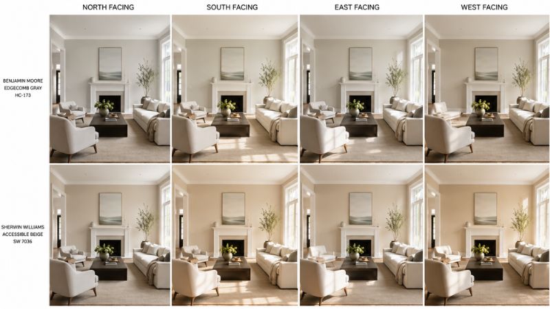
North-Facing Rooms
North-facing rooms receive cooler, indirect light throughout the day.
Edgecomb Gray
- Appears slightly grayer.
- Maintains a soft, sophisticated look.
- Ideal if you prefer subtle neutrals.
Accessible Beige
- Retains warmth.
- Prevents the room from feeling cold.
- Often the better choice for darker spaces.
Winner: Accessible Beige
South-Facing Rooms
South-facing rooms enjoy abundant warm sunlight.
Both colors perform exceptionally well.
Edgecomb Gray becomes bright and elegant without washing out.
Accessible Beige looks warm and luxurious while maintaining depth.
Winner: Tie
East-Facing Rooms
Morning sunlight enhances warm undertones.
Edgecomb Gray appears fresh and airy during the morning hours.
Accessible Beige develops a soft golden warmth that feels inviting without becoming yellow.
West-Facing Rooms
Afternoon sunlight tends to intensify warm tones.
Edgecomb Gray shifts toward a creamier greige.
Accessible Beige becomes noticeably richer and cozier, making it especially appealing for living spaces used in the evening.
Designer Tip
Before committing to either color, paint large sample boards and observe them in your room over several days. Natural daylight, evening lighting, flooring, and surrounding furnishings can dramatically influence how each shade appears on your walls. Testing first is one of the simplest ways to avoid costly repainting and ensures the color complements your home’s unique conditions.
Which Paint Color Works Best in Different Rooms?
Choosing between Benjamin Moore Edgecomb Gray vs Accessible Beige isn’t just about undertones—it also depends on how you use each room. Lighting, furniture, flooring, and even the amount of natural sunlight all influence how these colors perform.
Let’s compare them room by room to help you make the right decision for your home improvement project.
Edgecomb Gray vs Accessible Beige for Living Room
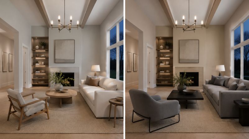
The living room is often the largest and most frequently used space in a home. It should feel welcoming while remaining stylish enough to accommodate changing furniture and décor over the years.
Why Choose Edgecomb Gray for a Living Room?
Edgecomb Gray creates an open, airy atmosphere that works especially well in homes with large windows. Because of its higher LRV (63.09), it reflects more natural light, making the space feel brighter and larger.
It pairs beautifully with:
- White sectional sofas
- Natural oak coffee tables
- Linen curtains
- Black metal lighting
- Marble fireplaces
- Soft blue or sage green accents
This combination creates a relaxed, designer-inspired interior often seen in Scandinavian and coastal homes.
Why Choose Accessible Beige for a Living Room?
Accessible Beige offers a warmer, more intimate feeling. It works exceptionally well in family rooms where comfort is the priority.
It pairs beautifully with:
- Leather sofas
- Walnut furniture
- Cream area rugs
- Brass lighting
- Natural woven baskets
- Warm wood flooring
The result is a cozy yet sophisticated space that feels inviting throughout the year.
Designer Recommendation
Choose Edgecomb Gray if your living room has abundant natural light and modern furnishings.
Choose Accessible Beige if you want a comfortable, timeless family space with warm textures.
Edgecomb Gray vs Accessible Beige for Kitchen
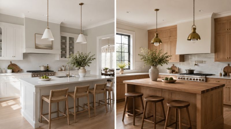
The kitchen is one of the most important spaces in any home. Neutral paint colors should complement cabinets, countertops, flooring, and appliances without competing for attention.
When comparing Edgecomb Gray vs Accessible Beige for kitchen, both colors perform exceptionally well—but in different ways.
Edgecomb Gray in the Kitchen
Edgecomb Gray looks particularly beautiful alongside:
- White shaker cabinets
- Quartz countertops
- Stainless steel appliances
- Matte black hardware
- White subway tile backsplashes
- Light oak flooring
Its lighter appearance keeps kitchens feeling clean and spacious, making it ideal for smaller kitchens or open-concept homes.
Best Kitchen Style
- Modern
- Coastal
- Transitional
- Scandinavian
- Contemporary
Accessible Beige in the Kitchen
Accessible Beige brings warmth to kitchens with natural materials.
It pairs well with:
- Cream cabinets
- Warm white cabinetry
- Walnut islands
- Butcher block countertops
- Travertine flooring
- Bronze hardware
This creates a welcoming kitchen that feels comfortable rather than overly bright.
Best Kitchen Style
- Farmhouse
- Rustic
- Traditional
- Organic Modern
- French Country
Which Kitchen Color Wins?
If your kitchen has cool finishes and limited warmth, Edgecomb Gray provides balance.
If your kitchen already includes warm woods and earthy materials, Accessible Beige creates better harmony.
Which Paint Color Is Better for Bedrooms?
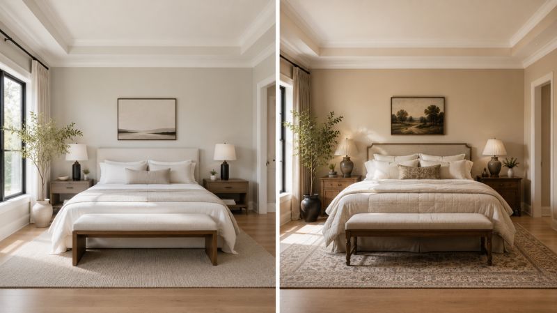
Bedrooms should promote relaxation while coordinating with bedding, furniture, and flooring.
Edgecomb Gray Bedrooms
Edgecomb Gray creates a peaceful retreat.
It works especially well with:
- White bedding
- Gray upholstered headboards
- Natural wood furniture
- Soft blue décor
- Linen textiles
- Minimalist styling
The room feels fresh and calming without appearing cold.
Accessible Beige Bedrooms
Accessible Beige creates warmth and comfort.
Pair it with:
- Cream bedding
- Dark wood furniture
- Woven rugs
- Soft terracotta accents
- Olive green décor
- Warm lighting
The result is a cozy bedroom perfect for relaxation.
Bedroom Winner
Modern bedrooms → Edgecomb Gray
Traditional bedrooms → Accessible Beige
Which Paint Color Looks Better in Bathrooms?
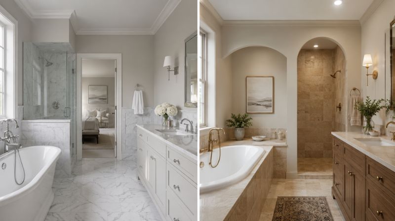
Bathrooms often have limited natural light, making paint selection especially important.
Edgecomb Gray Bathrooms
Edgecomb Gray complements:
- White subway tile
- Marble countertops
- Chrome fixtures
- Frameless glass showers
- White vanities
Its lighter tone helps bathrooms feel larger and cleaner.
Accessible Beige Bathrooms
Accessible Beige pairs well with:
- Beige stone tile
- Brass fixtures
- Warm oak vanities
- Natural stone countertops
- Soft cream towels
It creates a spa-inspired atmosphere that feels warm and luxurious.
Which Paint Color Works Best in Dining Rooms?
Dining rooms benefit from colors that encourage warmth and conversation.
Edgecomb Gray
Creates:
- Elegant atmosphere
- Contemporary appearance
- Bright entertaining space
Works beautifully with:
- Black dining tables
- White chairs
- Glass lighting
- Modern artwork
Accessible Beige
Creates:
- Warm hospitality
- Traditional elegance
- Comfortable entertaining
Pairs with:
- Walnut dining tables
- Brass chandeliers
- Linen curtains
- Antique décor
Which Color Is Better for Hallways and Entryways?
Hallways often receive limited natural light.
Edgecomb Gray helps brighten narrow spaces because of its higher reflectance.
Accessible Beige adds depth and warmth but may feel slightly darker in tight hallways.
If your goal is making your home feel larger from the front door onward, Edgecomb Gray is often the stronger choice.
Which Paint Color Works Better in Open Floor Plans?
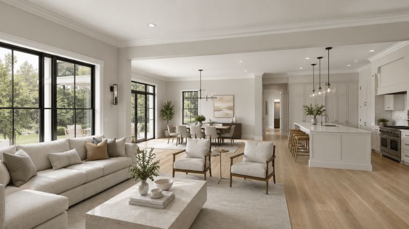
Modern homes frequently combine kitchens, dining rooms, and living rooms into one large open space.
In these layouts, wall color must flow naturally from one area to another.
Why Edgecomb Gray Excels
Because it reflects more light, Edgecomb Gray creates continuity without overwhelming the space.
It complements:
- White trim
- Black windows
- Oak flooring
- Quartz counters
- Minimalist décor
Its versatility makes it one of the best whole-house paint colors.
Why Accessible Beige Works
Accessible Beige creates warmth across connected rooms.
It pairs beautifully with:
- Natural stone
- Rustic beams
- Warm wood cabinetry
- Earth-toned textiles
It gives open spaces a welcoming, cohesive feel.
Which Paint Color Makes a Room Look Bigger?
One of the most common homeowner questions is whether paint color can visually enlarge a room.
The answer is yes.
Because Edgecomb Gray has a higher LRV (63.09) than Accessible Beige (58), it reflects more light.
This can make:
- Small bedrooms feel larger
- Hallways appear wider
- Ceilings seem taller
- Compact living rooms feel more open
Accessible Beige, while slightly darker, creates visual depth that can make large rooms feel more comfortable rather than cavernous.
For Small Spaces
Choose:
- Edgecomb Gray
- White trim
- Light flooring
- Minimal contrast
For Large Rooms
Choose:
- Accessible Beige
- Warm wood furniture
- Layered textiles
- Rich accent colors
Which Furniture Colors Pair Best?
Paint color should enhance—not compete with—your furniture.
Furniture That Looks Great with Edgecomb Gray
- White sofas
- Gray upholstery
- Light oak furniture
- Black coffee tables
- Marble accents
- Glass décor
- Chrome finishes
- Navy accent chairs
This palette creates a modern, clean aesthetic.
Furniture That Looks Great with Accessible Beige
- Walnut furniture
- Leather seating
- Cream upholstery
- Brass lighting
- Natural wood tables
- Rattan accents
- Linen fabrics
- Woven textures
This combination feels warm and timeless.
What Flooring Complements Each Color?
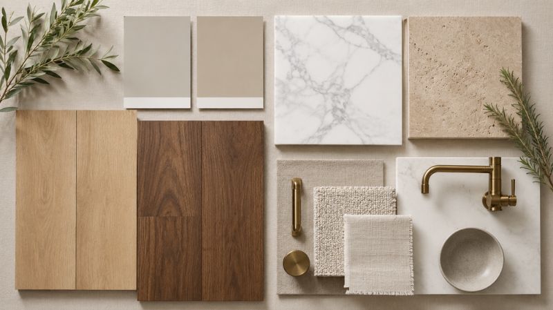
Flooring significantly influences how wall colors appear.
Best Flooring for Edgecomb Gray
- White oak
- Light maple
- Blonde hardwood
- Light gray tile
- Polished concrete
- White marble
These surfaces enhance its bright, airy character.
Best Flooring for Accessible Beige
- Medium oak
- Walnut
- Hickory
- Travertine
- Beige porcelain tile
- Warm luxury vinyl plank
These materials reinforce its earthy warmth.
Real Homeowner Example
A homeowner renovating a 2,300-square-foot suburban home wanted one neutral paint color throughout the main floor. The home featured white shaker cabinets, light oak flooring, black window frames, and plenty of south-facing windows.
Initially, the homeowner considered Accessible Beige for its warmth. However, after testing large paint samples on different walls, they noticed that it appeared slightly too rich in the bright afternoon sunlight.
Edgecomb Gray, by contrast, maintained a soft greige tone throughout the day. It reflected natural light beautifully, making the open-concept living room and kitchen feel larger while providing a seamless transition into the dining area. The final result was a bright, cohesive interior that complemented both modern furnishings and natural wood finishes without feeling stark or overly cool.
This example highlights the importance of sampling paint in your own home before making a final decision.
Professional Designer Tips
To get the best results from either paint color:
- Always test large peel-and-stick or painted samples on multiple walls.
- Observe the color in morning, afternoon, and evening light.
- Consider the undertones of your flooring, countertops, and cabinetry.
- Pair warm neutrals with layered textures such as linen, wool, wood, and woven décor for added depth.
- Use quality paint finishes appropriate for each room—eggshell for living spaces, satin for kitchens and bathrooms, and matte for low-traffic bedrooms if desired.
- Coordinate trim, ceiling, and wall colors to create a cohesive flow throughout the home rather than selecting each room in isolation.
By taking these steps, you’ll choose a paint color that not only looks beautiful on a sample card but also performs well in your home’s unique lighting and design conditions.
Can Edgecomb Gray and Accessible Beige Be Used on Home Exteriors?
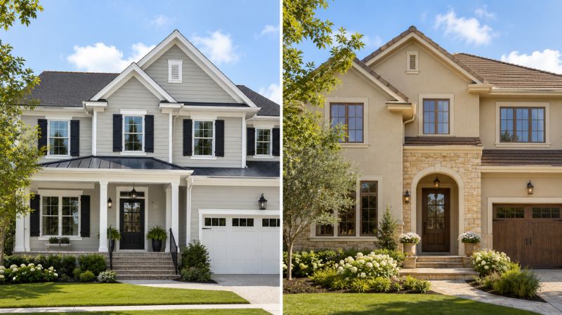
Absolutely. Both colors are popular choices for exterior siding because they remain attractive in changing daylight and complement a wide variety of roofing and landscaping materials.
Edgecomb Gray for Exteriors
Edgecomb Gray gives a home a light, refined appearance that works especially well with:
- White trim
- Black shutters
- Stone veneer
- White brick
- Gray roofing
- Natural wood front doors
It suits coastal, modern farmhouse, Scandinavian, and transitional architecture.
Accessible Beige for Exteriors
Accessible Beige offers a richer exterior palette and pairs beautifully with:
- Cream trim
- Dark bronze accents
- Natural stone
- Brown roofing
- Wooden garage doors
- Warm brick
It is an excellent choice for craftsman, traditional, and rustic-style homes.
Which Interior Design Styles Do They Suit?
Edgecomb Gray
Works exceptionally well with:
- Modern
- Contemporary
- Scandinavian
- Coastal
- Minimalist
- Transitional
Its clean greige appearance complements uncluttered interiors and abundant natural light.
Accessible Beige
Perfect for:
- Farmhouse
- Traditional
- Rustic
- Organic Modern
- French Country
- Transitional
Its warmth pairs naturally with layered textures, vintage furniture, and earthy décor.
Pros and Cons
Benjamin Moore Edgecomb Gray
Pros
- Brightens smaller rooms.
- Higher LRV reflects more natural light.
- Excellent whole-house paint color.
- Works with cool and warm décor.
- Timeless, designer-approved neutral.
- Great resale appeal.
Cons
- Can reveal subtle green undertones in certain lighting.
- May feel too light in very bright south-facing rooms.
- Doesn’t provide as much warmth as Accessible Beige.
Sherwin-Williams Accessible Beige
Pros
- Warm and inviting.
- Rich without feeling dark.
- Complements wood finishes beautifully.
- Excellent for cozy interiors.
- Flexible enough for traditional and modern homes.
- Performs well under artificial lighting.
Cons
- Slightly darker than Edgecomb Gray.
- Can feel heavy in rooms with limited natural light.
- Not as airy in small spaces.
Which Color Offers Better Resale Value?
Neutral paint colors consistently rank among the safest choices when preparing a home for sale because they appeal to the widest range of buyers.
Edgecomb Gray
A great option if your goal is to create bright, move-in-ready spaces that photograph well for online listings. Its lighter appearance also helps smaller rooms feel more spacious during showings.
Accessible Beige
Ideal for homes with traditional architecture, warm wood finishes, or rustic design elements. It creates an inviting atmosphere that many buyers associate with comfort and quality.
Resale Tip: Rather than chasing short-lived color trends, choose a neutral that complements your home’s flooring, cabinetry, and fixed finishes. A cohesive color palette throughout the home often leaves a stronger impression than any single paint color.
Conclusion
The comparison between Benjamin Moore Edgecomb Gray vs Accessible Beige comes down to more than just color—it reflects the atmosphere you want to create in your home.
Edgecomb Gray stands out for its bright, airy feel, making it an excellent choice for modern interiors, open-concept layouts, and homes with abundant natural light. Its balanced greige undertones provide flexibility, allowing it to work beautifully with contemporary furniture, cool-toned finishes, and minimalist décor.
Accessible Beige, on the other hand, excels in creating warmth and comfort. Its richer beige and taupe undertones complement traditional, farmhouse, and organic modern interiors, making living spaces feel welcoming and relaxed throughout the day.
Before making your final decision, test both colors in your own home under natural and artificial lighting. Paint samples viewed at different times of day will reveal how undertones interact with your flooring, cabinetry, furnishings, and overall design style. Investing a little extra time in sampling can help ensure a result you’ll love for years to come.
With the right paint color, thoughtful furniture selection, and coordinated décor, you can create a home that feels timeless, stylish, and uniquely yours.
Frequently Asked Questions
1. Is Edgecomb Gray warmer than Accessible Beige?
No. Both are warm neutrals, but Accessible Beige has stronger beige and taupe undertones, making it feel noticeably warmer than Edgecomb Gray.
2. Which color has more gray undertones?
Edgecomb Gray contains more visible gray undertones, while Accessible Beige leans further toward beige and taupe.
3. Does Accessible Beige ever look gray?
Yes. In rooms with cool lighting or north-facing exposure, Accessible Beige may reveal more of its subtle gray influence, though it generally remains warmer than Edgecomb Gray.
4. Is Edgecomb Gray a true gray paint color?
No. Despite its name, Edgecomb Gray is a warm greige that blends gray and beige, making it softer and more versatile than many traditional gray paints.
5. Which paint color works best with white trim?
Both colors pair beautifully with white trim. Edgecomb Gray often looks best with crisp whites, while Accessible Beige benefits from soft, warm whites.
6. Which paint color is better for kitchens?
If you’re comparing Edgecomb Gray vs Accessible Beige for kitchen spaces, Edgecomb Gray is ideal for bright, modern kitchens, while Accessible Beige complements warm wood cabinetry and farmhouse-inspired designs.
7. Which color makes a room appear larger?
Edgecomb Gray, thanks to its higher LRV of 63.09, reflects more light and generally makes small rooms feel larger and more open.
8. Which is better for a living room?
When choosing Edgecomb Gray vs Accessible Beige for living room spaces, Edgecomb Gray suits airy, contemporary interiors, while Accessible Beige creates a cozy and welcoming atmosphere.
9. Can I use either color throughout my entire house?
Yes. Both colors work well as whole-house paint choices when paired with coordinating trim, flooring, and furnishings.
10. Which paint color is more timeless?
Both have proven their longevity. Edgecomb Gray offers a fresh, versatile look, while Accessible Beige delivers classic warmth that complements a wide range of architectural styles.