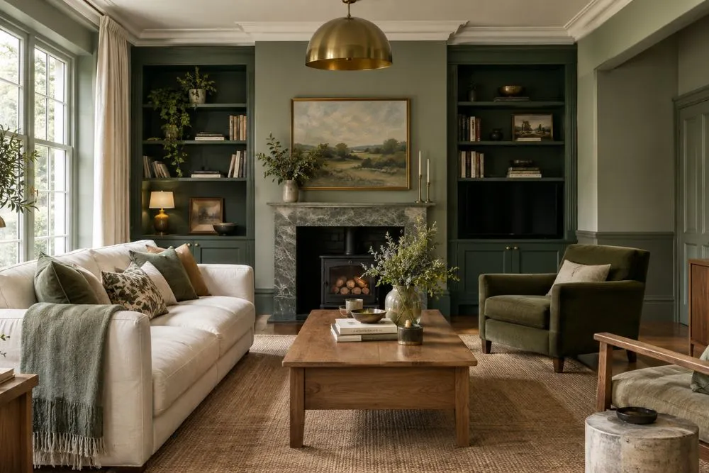
The Farrow and Ball green colour chart features everything from soft sage and gray-green neutrals to rich olive, smoky, and deep forest-inspired shades. For a home, the right green depends on the room’s natural light, existing furniture, undertones, trim, flooring, and the atmosphere you want to create.
The best Farrow & Ball green shades for interiors include Green Smoke, Calke Green, Pigeon, French Gray, Mizzle, Lichen, Card Room Green, Bancha, Vert de Terre, Studio Green, and other muted, earthy, and dramatic greens. Use lighter gray-green shades for airy bedrooms and bathrooms, medium greens for kitchens and living rooms, and deeper greens for studies, dining rooms, cabinetry, and cozy accent walls.
Farrow and Ball Green Colour Chart at a Glance

| Farrow & Ball Green Shade | No. | Color Character | Ideal Room | Best With |
| Pigeon | 25 | Blue-gray-green | Kitchen | White, brass, oak |
| Green Smoke | 47 | Smoky deep green | Living room | Cream, wood, brass |
| French Gray | 18 | Soft gray-green | Kitchen | Warm white, wood |
| Lichen | 19 | Muted earthy green | Bedroom | Cream, linen, oak |
| Card Room Green | 79 | Rich muted green | Study | Dark wood, brass |
| Mizzle | 266 | Soft gray-green | Bedroom | White, beige, natural wood |
| Vert de Terre | 234 | Light earthy green | Bedroom | Off-white, oak |
| Bancha | 298 | Deep olive green | Dining room | Walnut, leather |
| Calke Green | 34 | Traditional muted green | Kitchen | Natural wood, cream |
| Breakfast Room Green | 81 | Fresh mid green | Kitchen | White, light wood |
| Studio Green | 93 | Very deep green | Study | Brass, leather |
| Sap Green | 199 | Natural mid green | Living room | Cream, wood |
| Duck Green | W55 | Rich deep green | Dining room | Brass, walnut |
| Green Ground | 206 | Pale green | Living room | Warm neutrals |
| Cooking Apple Green | 32 | Fresh light green | Kitchen | White, oak |
| Ball Green | 75 | Silvery muted green | Dining room | Cream, brass |
| Eddy | 301 | Soft muted green | Bedroom | Beige, linen |
| Cromarty | 285 | Pale gray-green | Bathroom | White, stone |
| Treron | 292 | Complex gray-green | Living room | Wood, taupe |
| Inchyra Blue | 289 | Blue-green gray | Study | Charcoal, brass |
| Churlish Green | 251 | Earthy yellow-green | Living room | Brown, cream |
| Dibber | 312 | Earthy green | Dining room | Terracotta, wood |
| Arsenic | 214 | Vibrant green | Bathroom | White, natural wood |
| Yeabridge Green | 287 | Clear historic green | Accent wall | Warm neutrals |
Note: The 25 shades above are a curated selection of Farrow & Ball greens and green-leaning colors. Farrow & Ball’s official color system separates colors into groups, and the Green filter can change as palettes and regional listings are presented. Always verify the current product name, number, availability, and finish before ordering.
What Is the Farrow and Ball Green Colour Chart?
The Farrow and Ball green colour chart is essentially a way to explore the brand’s range of green and green-influenced paint colors by hue, depth, and character.
Rather than consisting only of obvious grass or forest greens, the palette includes colors that move toward gray, blue, olive, sage, yellow, and earthy neutrals.
That is one reason Farrow & Ball greens can work across very different interior styles. A muted gray-green can behave almost like a neutral, while a deep green can create a dramatic, enveloping room.
Farrow & Ball’s official color listings currently identify Green as a distinct color group, while some green-palette resources include neighboring shades that have noticeable green undertones.
How Many Farrow and Ball Green Paint Colors Are There?
The answer depends on how the palette is categorized.
On Farrow & Ball’s current regional website, the Green filter shows 18 colors, while broader databases and green-palette guides include additional shades that are classified elsewhere but can read green or green-gray in an interior.
This distinction matters when creating a color chart. Calling every green-leaning Farrow & Ball shade an official Green-category color can make a guide technically misleading.
For homeowners, however, the broader selection is useful because colors such as Pigeon, Mizzle, French Gray, and Inchyra Blue can contribute a distinctly green appearance depending on lighting and surrounding finishes.
What Are the 25 Best Farrow and Ball Green Shades?
1. Farrow & Ball Pigeon No. 25
Pigeon is a blue-gray shade with a noticeable green character. Farrow & Ball describes it as a cozy and nostalgic blue gray, and its official material highlights applications such as boot rooms, cloakrooms, studies, paneling, and kitchen islands.
In a kitchen, Pigeon works particularly well with warm white walls, natural oak, marble-look surfaces, and mixed-metal hardware.
Best for: Kitchen cabinets, islands, studies, hallways, and smaller rooms.
Pair it with: Warm whites, oak, brass, cream, and soft black accents.
2. Farrow & Ball Green Smoke No. 47
Green Smoke is one of the most recognizable Farrow & Ball green paint colors. It is a smoky, deep green with a subdued quality that works particularly well when you want a room to feel intimate rather than bright.
It can be used across walls for a color-drenched effect or restricted to cabinetry, doors, or an accent wall.
Best for: Living rooms, studies, bedrooms, cabinetry, and media rooms.
Pair it with: Cream, natural wood, brass, warm beige, and muted pink.
3. Farrow & Ball French Gray No. 18
French Gray occupies the border between gray and green, which makes it especially useful for homeowners who want color without a strongly saturated wall.
Designer coverage frequently highlights its ability to change with lighting and surrounding finishes.
Best for: Kitchens, cabinetry, bedrooms, hallways, and millwork.
Pair it with: Warm whites, pale oak, stone, linen, and aged brass.
4. Farrow & Ball Lichen No. 19
Lichen is a muted, nature-inspired green that feels more understated than a traditional mid-green.
Its earthy quality makes it particularly suitable for bedrooms, living spaces, and rooms filled with natural materials.
Best for: Bedrooms, living rooms, hallways, and cabinetry.
Pair it with: Cream, pale wood, beige, woven textures, and natural stone.
5. Farrow & Ball Card Room Green No. 79
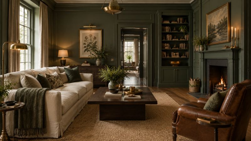
Card Room Green is a richer, more traditional green that brings depth to an interior without requiring a near-black shade.
It is particularly effective in studies, libraries, dining rooms, and rooms containing substantial wood furniture.
Best for: Studies, libraries, dining rooms, and living rooms.
Pair it with: Walnut, leather, antique brass, cream upholstery, and dark wood.
6. Farrow & Ball Mizzle No. 266
Mizzle is a soft gray-green with a restrained appearance. It can be useful when you want green walls without the visual intensity of a saturated green.
It is particularly well suited to bedrooms and bathrooms where a calm, muted backdrop is desirable.
Best for: Bedrooms, bathrooms, hallways, and quiet living spaces.
Pair it with: White, beige, pale oak, linen, and soft gray.
7. Farrow & Ball Vert de Terre No. 234
Vert de Terre sits toward the lighter, softer side of the green spectrum.
It is a practical choice for homeowners who want an organic color but still want a room to retain an airy appearance.
Best for: Bedrooms, nurseries, bathrooms, and light-filled living rooms.
Pair it with: Off-white, light oak, cream, natural fibers, and muted blush.
8. Farrow & Ball Bancha No. 298
Bancha is a deeper olive green that provides considerably more visual weight than pale sage colors.
It is especially effective where you want walls to feel grounded and substantial without moving into a nearly black green.
Best for: Dining rooms, kitchens, studies, and cabinetry.
Pair it with: Walnut, leather, terracotta, cream, and antique brass.
9. Farrow & Ball Calke Green No. 34
Calke Green is one of the recognizable traditional Farrow & Ball greens. The brand’s official material connects the name with Calke Abbey, and its current palette places it among the darker green selections.
Use it when you want an interior that feels historic, earthy, and collected.
Best for: Kitchens, dining rooms, living rooms, cabinetry, and period-style homes.
Pair it with: Natural oak, cream, stone, brass, and warm textiles.
10. Farrow & Ball Breakfast Room Green No. 81
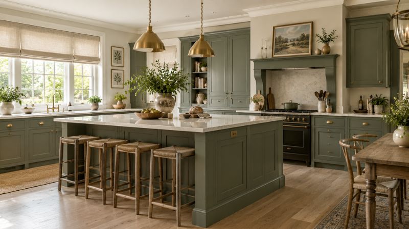
Breakfast Room Green is a lively mid-tone green. Farrow & Ball describes it as one of its cheerful greens and connects the name with morning light and breakfast rooms.
It can brighten a kitchen or dining space without requiring a very pale wall color.
Best for: Kitchens, breakfast rooms, dining rooms, and sunny living areas.
Pair it with: White, pale wood, brass, cream, and botanical accents.
11. Farrow & Ball Studio Green No. 93
Studio Green is among the deepest greens in the Farrow & Ball range. The brand describes it as its darkest green and notes its ability to function almost as an alternative to black.
Because of its depth, it can make a powerful statement on cabinetry, doors, woodwork, or a small room.
Best for: Studies, libraries, cabinetry, doors, and dramatic accent walls.
Pair it with: Brass, walnut, leather, cream, and warm lighting.
12. Farrow & Ball Sap Green No. 199
Sap Green is a more straightforward, nature-inspired green than many of the muted gray-green options.
It can introduce a fresher feeling into a living room or dining space while still working with traditional materials.
Best for: Living rooms, dining rooms, cabinetry, and accent walls.
Pair it with: Cream, natural wood, linen, rattan, and warm metal.
13. Farrow & Ball Duck Green No. W55
Duck Green is a strong, saturated green that works particularly well when the objective is a statement rather than a barely-there neutral.
Use it carefully in smaller rooms, or use it confidently across walls when you want an immersive effect.
Best for: Dining rooms, studies, libraries, cabinetry, and feature walls.
Pair it with: Walnut, cream, brass, leather, and warm neutral fabrics.
14. Farrow & Ball Green Ground No. 206
Green Ground is a much lighter option and can provide a softer alternative to stronger sage and olive shades.
It works particularly well in rooms where the walls need to remain visually light while still introducing a natural color.
Best for: Bedrooms, living rooms, nurseries, kitchens, and bathrooms.
Pair it with: Warm white, pale oak, beige, rattan, and natural linen.
15. Farrow & Ball Cooking Apple Green No. 32
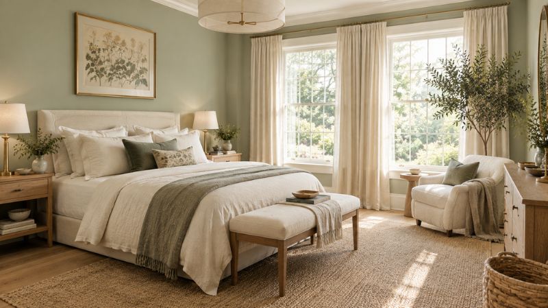
Cooking Apple Green is a fresher and brighter direction for homeowners who find muted greens too restrained.
It can add energy to a kitchen or breakfast area, particularly when combined with simple white cabinetry and natural materials.
Best for: Kitchens, breakfast rooms, utility rooms, and children’s spaces.
Pair it with: White, light oak, cream, natural stone, and botanical patterns.
16. Farrow & Ball Ball Green No. 75
Ball Green has a muted, silvery quality that can change considerably according to lighting.
Its association with dining spaces is particularly interesting because Farrow & Ball material notes its almost silver appearance in candlelight.
Best for: Dining rooms, living rooms, bedrooms, and fitted furniture.
Pair it with: Cream, warm white, brass, walnut, and muted rose.
17. Farrow & Ball Eddy No. 301
Eddy belongs to the softer side of the green spectrum and can work as a subtle backdrop where stronger greens would dominate the furniture.
Try it with tactile fabrics and pale woods for a relaxed, modern-organic room.
Best for: Bedrooms, living rooms, nurseries, and hallways.
Pair it with: Beige, cream, pale oak, linen, and woven accessories.
18. Farrow & Ball Cromarty No. 285
Cromarty is a soft, restrained color that sits comfortably within a pale green-gray palette.
It is particularly useful for homeowners who want walls to provide color while remaining visually quiet.
Best for: Bathrooms, bedrooms, kitchens, and hallways.
Pair it with: White, limestone, pale oak, cream, and brushed metal.
19. Farrow & Ball Treron No. 292
Treron is a complex green-gray that can bridge the gap between a conventional green and a neutral.
This makes it useful when furniture and architectural details need to remain the main focus.
Best for: Living rooms, kitchens, hallways, and cabinetry.
Pair it with: Taupe, natural wood, cream, stone, and aged brass.
20. Farrow & Ball Inchyra Blue No. 289
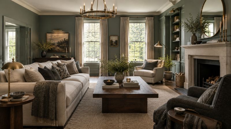
Inchyra Blue is technically a blue, but it is frequently discussed alongside Farrow & Ball green paint colors because its appearance can move toward green and gray depending on the lighting.
Livingetc specifically includes it among designer discussions of Farrow & Ball’s best green-adjacent colors.
Best for: Studies, libraries, dining rooms, cabinetry, and color-drenched spaces.
Pair it with: Warm white, leather, walnut, brass, and charcoal.
21. Farrow & Ball Churlish Green No. 251
Churlish Green provides a more earthy and yellow-influenced direction than blue-green shades such as Pigeon.
It works particularly well when a room already contains warm timber, leather, terracotta, or antique finishes.
Best for: Living rooms, dining rooms, studies, and traditional interiors.
Pair it with: Brown, cream, walnut, terracotta, and aged brass.
22. Farrow & Ball Dibber No. 312
Dibber is an earthy green with enough character to act as a focal color.
It can be particularly effective when repeated through upholstery, cushions, artwork, or plants rather than used exclusively on the walls.
Best for: Dining rooms, living rooms, cabinetry, and accent walls.
Pair it with: Terracotta, warm wood, cream, bronze, and natural fibers.
23. Farrow & Ball Arsenic No. 214
Arsenic offers a more energetic green direction than the subdued sage and gray-green colors.
It is better suited to homeowners who want the wall color itself to become part of the room’s personality.
Best for: Bathrooms, powder rooms, creative spaces, and accent walls.
Pair it with: Crisp white, natural wood, warm brass, and restrained neutral furnishings.
24. Farrow & Ball Yeabridge Green No. 287
Yeabridge Green is a stronger historic green associated with an 18th-century Hamstone farmhouse in Somerset. Farrow & Ball’s current material describes its origin through a clear, vivid green discovered on cabinetry at the property.
It can be used when you want more traditional character and stronger chromatic presence.
Best for: Dining rooms, cabinetry, studies, doors, and feature walls.
Pair it with: Cream, natural timber, brass, and muted warm colors.
25. Farrow & Ball French Gray, Pigeon, Mizzle and Other Green-Gray Neutrals
For homeowners who cannot decide between green and gray, the green-gray section of the palette deserves special attention.
French Gray, Pigeon, Mizzle, Treron, and related shades demonstrate how green can function as a neutral while retaining more personality than conventional beige or gray.
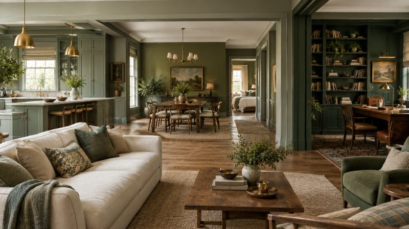
This category is especially useful for open-plan homes where the wall color must coordinate with several furniture styles.
Which Farrow and Ball Green Shades Are Best for Each Room?
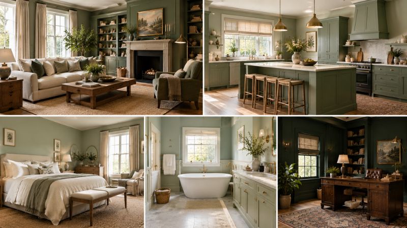
What Is the Best Farrow and Ball Green for a Living Room?
For living rooms, consider Green Smoke, Calke Green, Castle Gray, Card Room Green, Ball Green, or Sap Green.
A large south-facing living room can generally accommodate deeper colors more easily than a dark room with limited daylight, but the actual result depends on windows, flooring, furnishings, and artificial lighting.
Mindful Hues’ competing guide focuses heavily on living-room applications, covering 15 Farrow & Ball shades and pairing each with furniture, textiles, and lighting suggestions.
The opportunity here is to go beyond a living-room list and help readers select greens for the entire home.
What Is the Best Farrow and Ball Green for a Kitchen?
Pigeon, French Gray, Calke Green, Mizzle, and Breakfast Room Green are useful starting points.
For kitchen cabinets, always compare the paint with the countertop, backsplash, flooring, appliances, and hardware.
A blue-green such as Pigeon can work beautifully with mixed metals, while a warmer green such as Calke Green can harmonize with natural timber and warm stone.
What Is the Best Farrow and Ball Green for a Bedroom?
For bedrooms, look toward Mizzle, Lichen, Vert de Terre, Cromarty, Green Ground, and Eddy.
Muted greens generally create a quieter backdrop than highly saturated greens.
Pair them with natural linen, upholstered furniture, pale oak, warm white bedding, and soft lighting to create a cohesive bedroom palette.
What Is the Best Farrow and Ball Green for a Bathroom?
Lighter green-gray colors can work particularly well in bathrooms because they coordinate naturally with white sanitaryware and stone.
Consider Mizzle, Cromarty, French Gray, Green Ground, or a more energetic color such as Arsenic if you want a stronger statement.
For areas exposed to moisture, choose a paint finish specifically designed for the conditions of the surface and room.
What Is the Best Farrow and Ball Green for a Dining Room?
Dining rooms are excellent locations for richer greens.
Card Room Green, Bancha, Ball Green, Duck Green, and Studio Green can create a more intimate setting, particularly when combined with warm pendant lighting, timber furniture, and brass details.
Ball Green is especially interesting for evening dining because Farrow & Ball describes its appearance as becoming almost silver in candlelight.
What Is the Best Farrow and Ball Green for a Study?
For a study or library, consider Card Room Green, Studio Green, Green Smoke, Inchyra Blue, or Duck Green.
Deep colors can make bookshelves, artwork, wood furniture, and brass lighting stand out.
For a small study, painting the walls and woodwork in a related deep tone can create a visually cohesive effect rather than breaking the room into multiple competing blocks of color.
How Does Lighting Change Farrow and Ball Green Paint Colors?
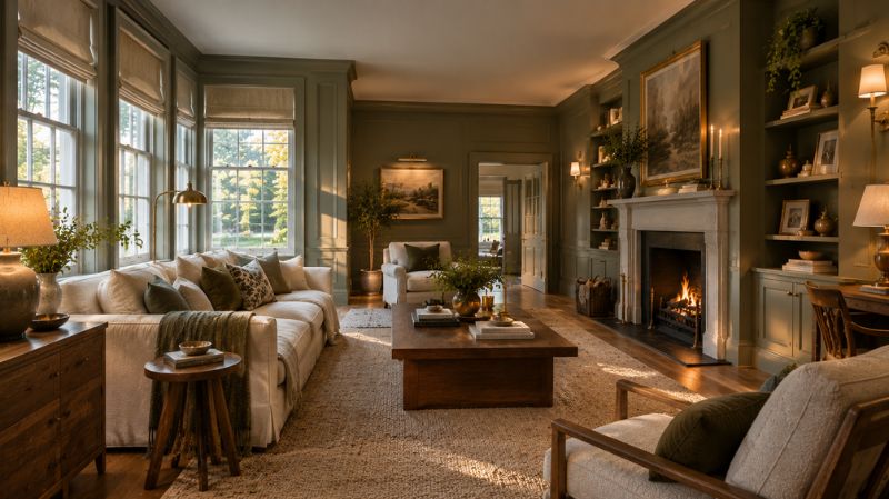
Lighting is one of the most important factors when choosing green wall paint.
The same color can appear warmer, cooler, grayer, brighter, or deeper depending on the direction and intensity of light.
How Do North-Facing Rooms Affect Green Paint?
North-facing rooms typically receive cooler, less direct daylight.
Gray-green and blue-green colors can therefore appear cooler or more subdued.
If the room already feels shadowy, compare a large sample against the flooring and furnishings before choosing a very dark green.
How Do South-Facing Rooms Affect Green Paint?
South-facing rooms generally receive stronger, warmer daylight for more of the day.
This can make greens appear more luminous and can emphasize warmer yellow or olive components.
Deep greens can also appear more balanced when abundant daylight reaches the room.
What Happens in East- and West-Facing Rooms?
East-facing rooms receive stronger morning light, while west-facing rooms receive warmer late-day light.
That means the same green can have different visual personalities throughout the day.
This is why a paint sample viewed only under a showroom’s lighting—or only on a phone screen—is not enough.
Farrow & Ball itself cautions that colors can appear different on monitors and recommends obtaining a physical color chart or sample.
Should You Choose a Warm or Cool Farrow and Ball Green?
Look at the colors already present in your room.
Warm Green Undertones
Greens with olive, yellow, or earthy influences tend to coordinate naturally with:
- Walnut
- Oak
- Terracotta
- Camel leather
- Cream
- Brass
- Warm beige
Bancha, Churlish Green, and several earthy greens can work well in these palettes.
Cool Green Undertones
Blue- and gray-influenced greens tend to work naturally with:
- Crisp or soft whites
- Gray
- Charcoal
- Pale woods
- Blue
- Silver
- Cool stone
Pigeon, Mizzle, and green-gray shades can be useful when the rest of the room has cooler elements.
What Colors Go With Farrow and Ball Green?
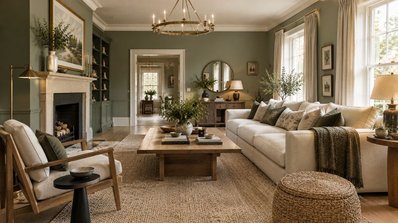
Do Green Walls Go With White?
Yes. White trim can create a crisp contrast against green walls, but the exact white matters.
A stark white may emphasize a cool green, while a warmer off-white can soften an earthy or olive green.
Do Green Walls Go With Cream?
Cream is particularly useful with traditional, olive, and muted greens.
It creates a softer transition than bright white and works naturally with wood furniture and woven textures.
Do Green Walls Go With Natural Wood?
Green and wood are a particularly useful combination for organic-inspired interiors.
Oak can keep a dark green room feeling lighter, while walnut can reinforce the richness of deeper greens.
Do Green Walls Go With Brass?
Brass hardware and lighting can add warmth against gray-green, olive, and deep green walls.
Use aged or brushed brass when you want a softer traditional effect and brighter brass when the room has a more contemporary character.
Do Green Walls Go With Black?
Black can work with green, but contrast should be considered carefully.
Against very dark green, black may visually disappear. Against a lighter sage or green-gray, black hardware can create a stronger graphic accent.
Which Farrow and Ball Green Shades Are Best for Small Rooms?
A small room does not automatically require white walls.
A muted green can make a compact space feel intentional and atmospheric, while a very dark green can create a more enclosed, dramatic effect.
For a small bathroom, powder room, study, or hallway, consider whether you want the space to feel airy and open or intimate and cocooning.
For an airy result, look toward Green Ground, Cromarty, Vert de Terre, or Mizzle.
For a dramatic result, consider Studio Green, Green Smoke, or Card Room Green.
Should You Paint the Ceiling and Trim Green Too?
Not necessarily, but using related colors across walls, trim, doors, and cabinetry can create a more unified interior.
For example, a deep green wall combined with a sharply contrasting white trim creates a classic two-color scheme.
Painting the trim in a similar green can create a more enveloping, contemporary effect.
The choice should depend on the room’s architecture, ceiling height, natural light, and the amount of contrast you want.
How Should You Test Farrow and Ball Green Paint Before Buying?
Never choose a green solely from a digital color chart.
1. Order a Physical Sample
Farrow & Ball recommends testing colors because screens do not reproduce paint colors reliably.
2. Test on a Large Surface
A small swatch can hide undertones.
Use a large sample board or a sufficiently large test area so you can see the color in context.
3. Move the Sample Around the Room
Check the color near windows, in corners, beside trim, and next to furniture.
4. Check Morning and Evening Light
Green can change substantially as daylight changes.
5. Compare Fixed Materials
Place the sample beside flooring, countertops, curtains, upholstery, cabinetry, and woodwork.
6. Look at Artificial Lighting
Warm bulbs can make some greens appear warmer and more yellow, while cooler lighting can emphasize blue or gray qualities.
Farrow and Ball Green Paint Colors by Color Family
| Color Family | Examples | Overall Effect | Good Rooms |
| Pale green | Green Ground, Vert de Terre | Airy and gentle | Bedroom, bathroom |
| Sage green | Lichen, Mizzle | Calm and natural | Bedroom, living room |
| Gray-green | French Gray, Pigeon, Treron | Versatile and sophisticated | Kitchen, hallway |
| Olive green | Bancha, Churlish Green | Warm and grounded | Dining room, kitchen |
| Mid green | Sap Green, Breakfast Room Green | Fresh and lively | Living room, kitchen |
| Smoky green | Green Smoke | Moody and sophisticated | Living room, study |
| Deep green | Card Room Green, Duck Green | Rich and intimate | Dining room, study |
| Very deep green | Studio Green | Dramatic and cocooning | Study, cabinetry |
How Can You Decorate With a Farrow and Ball Green Palette?
A successful green room is rarely just about the wall color.
Think about the room as a complete palette.
Start with the wall color, then choose a dominant furniture tone, a secondary textile color, a wood finish, and one or two accent metals.
For example, a Green Smoke living room could combine a cream sofa, walnut coffee table, natural-fiber rug, brass lighting, and muted botanical artwork.
A Pigeon kitchen could combine warm white walls, Pigeon cabinetry, oak flooring, brass hardware, and creamy quartz.
A Bancha dining room could use walnut furniture, cream upholstery, aged brass lighting, and terracotta accessories.
This approach prevents the paint from looking disconnected from the rest of the interior.
What Design Styles Work With Farrow and Ball Green?
Modern Organic
Choose Mizzle, Lichen, Green Ground, or Treron with oak, linen, stone, and woven materials.
English Country
Calke Green, Card Room Green, Lichen, and earthy olive shades complement traditional wood furniture and patterned textiles.
Modern Farmhouse
Use muted greens with warm whites, natural oak, black accents, and simple furniture.
Traditional
Deeper greens such as Card Room Green and Studio Green can support paneled walls, libraries, antique furniture, and classic lighting.
Coastal
Instead of relying only on blue, try a soft green-gray such as Pigeon, Mizzle, or French Gray with white, pale wood, linen, and natural textures.
Moody and Dramatic
Studio Green, Green Smoke, Duck Green, and Card Room Green can create a rich backdrop for darker furniture and warm metallic accents.
Farrow and Ball Green Palette: Light vs. Dark Shades
Choosing between light and dark green should begin with the desired atmosphere rather than the size of the room alone.
| Goal | Consider | Design Approach |
| Airy | Green Ground | White trim, pale wood |
| Soft | Mizzle | Linen and beige |
| Natural | Lichen | Oak and cream |
| Sophisticated | Pigeon | Brass and warm white |
| Earthy | Bancha | Walnut and terracotta |
| Moody | Green Smoke | Cream and brass |
| Dramatic | Studio Green | Leather and warm lighting |
What Is the Best Farrow and Ball Green for Cabinets?
Cabinetry is one of the best places to use green because it introduces color without requiring every wall to become saturated.
Pigeon is particularly useful for a blue-gray-green kitchen, while French Gray and Mizzle offer softer alternatives.
Calke Green and Bancha can make a stronger statement on kitchen islands or full-height cabinetry.
For dark, dramatic kitchens, Green Smoke or Studio Green can create a substantial architectural focal point.
Always test the cabinet color against your countertop and backsplash rather than evaluating the paint alone.
Can Farrow and Ball Green Paint Work on Exterior Walls?
Yes, selected Farrow & Ball greens can be used on exterior surfaces when the appropriate exterior paint system and finish are selected.
The brand’s product range includes exterior finishes, but interior and exterior products should not be treated as interchangeable.
For an exterior project, consider the roof, masonry, neighboring buildings, landscaping, front door, and natural surroundings before choosing a color.
A green that looks soft indoors can appear significantly stronger in full daylight.
What Is the Most Popular Farrow and Ball Green?
There is no single authoritative sales ranking that establishes one universal “most popular” Farrow & Ball green.
However, Pigeon, Green Smoke, Mizzle, French Gray, Calke Green, and other established shades recur frequently in designer articles, paint guides, and residential applications. Recent designer-focused coverage specifically highlights Pigeon, Mizzle, Green Smoke, and other Farrow & Ball colors.
Popularity should therefore be treated as context rather than a reason to choose a particular shade for your home.
Final Thoughts
The best way to use the Farrow and Ball green palette is to stop thinking of green as a single color family.
Pale greens such as Green Ground and Vert de Terre can keep rooms feeling light. Gray-green colors such as Pigeon, Mizzle, French Gray, and Treron offer neutral versatility. Olive greens such as Bancha create warmth, while Green Smoke, Card Room Green, and Studio Green provide depth and drama.
The most important step is to test the actual paint in your room.
Look at it beside your flooring, furniture, countertops, trim, and fabrics. Observe it in morning daylight, afternoon light, evening light, and artificial illumination.
Once you understand the undertones and lighting conditions, choosing among Farrow and Ball green paint colors becomes much easier—and the resulting wall color will feel connected to the entire room rather than selected in isolation.
Start with three samples from different parts of the palette—one light, one mid-tone, and one deeper shade. Compare them against your existing furniture and finishes before committing to the full room. A few carefully chosen samples can save you from an expensive repaint and help you create a green interior that feels intentional, balanced, and distinctly yours.
Frequently Asked Questions
What is the best Farrow and Ball green for a living room?
Green Smoke, Calke Green, Card Room Green, Pigeon, and Ball Green are useful options, with the final choice depending on lighting, furniture, flooring, and desired mood.
What is the best Farrow and Ball sage green?
Mizzle, Lichen, French Gray, and Vert de Terre are useful choices when you want a softer, muted green rather than a saturated green.
What is the best Farrow and Ball green for a kitchen?
Pigeon, French Gray, Calke Green, Mizzle, and Breakfast Room Green can all work well in kitchens, particularly when coordinated with the countertop, flooring, hardware, and cabinetry.
What colors go with Farrow and Ball green?
Green pairs naturally with warm whites, cream, beige, natural wood, brass, terracotta, charcoal, and selected pink or berry accents depending on the green’s undertones.
Is Farrow and Ball green good for small rooms?
Yes. Light and muted greens can keep a small room feeling relatively open, while deeper greens can intentionally create a cozy, enclosed atmosphere.
Does Farrow and Ball green change in different lighting?
Yes. Natural and artificial lighting can substantially alter how green, gray, blue, and yellow undertones are perceived, which is why physical sampling is important. Farrow & Ball also advises customers to check physical samples because digital displays can differ from real paint.
Is Pigeon green or blue?
Pigeon is officially described by Farrow & Ball as a blue gray, but it is frequently included in green-paint guides because its appearance can read blue-gray-green in interiors.
Is French Gray a green paint color?
French Gray is a green-influenced gray and is commonly included in green-palette resources because of its green character. It is particularly useful when you want a restrained green that behaves more like a neutral.
What is the darkest Farrow and Ball green?
Studio Green No. 93 is identified by Farrow & Ball as its darkest green and is described as an alternative to black.
Should I use white trim with Farrow and Ball green walls?
White trim can create a crisp contrast, but the ideal white depends on the green’s undertones. Warm greens often work naturally with softer whites, while cooler greens can accommodate cleaner whites.


