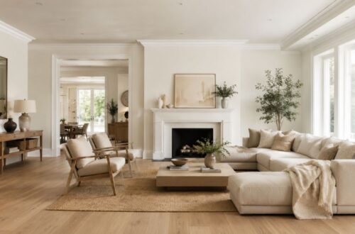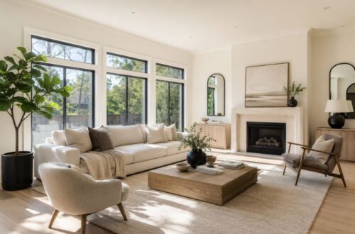
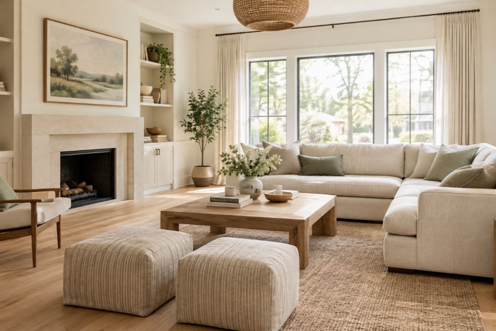
The best warm white paint colors create a welcoming, light-filled home without making walls look overly creamy or yellow. Shades such as Sherwin-Williams Alabaster, Benjamin Moore White Dove, and Sherwin-Williams Greek Villa are popular starting points, but the right choice depends on your room’s lighting, flooring, furniture, and preferred level of warmth.
If you want a soft white that feels comfortable rather than stark, focus on balanced undertones, test samples in your actual space, and compare each shade with your existing finishes before painting.
Which Warm White Paint Colors Won’t Look Yellow?
- Best all-around option: Benjamin Moore White Dove (OC-17)
- Best soft, warm white: Sherwin-Williams Alabaster (SW 7008)
- Best for a bright, inviting interior: Sherwin-Williams Greek Villa (SW 7551)
- Best for a cleaner-looking white: Sherwin-Williams Pure White (SW 7005)
- Best for a subtle, muted neutral: Sherwin-Williams Shoji White (SW 7042)
These are starting points, not universal guarantees. Even a balanced white can look yellow under warm lighting or beside cooler white finishes.
1. Benjamin Moore White Dove (OC-17)
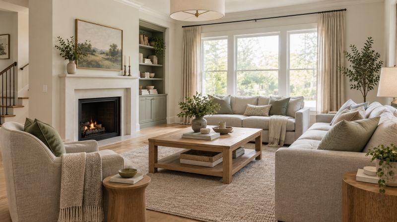
White Dove is an excellent starting point if you want a soft white that feels welcoming without looking as creamy as some traditional off-whites. Its subtle warmth works well in living rooms, bedrooms, hallways, and transitional interiors.
Pair it with natural oak flooring, linen curtains, warm gray upholstery, or muted green accents. It can also work on cabinets and trim, although the contrast with your wall color should be checked before committing.
Best for: Whole-home walls, trim, cabinetry, and traditional or contemporary interiors.
Watch out for: Its warmth can become more noticeable beside cooler, blue-based whites. Test it against your ceiling and existing woodwork first.
2. Sherwin-Williams Alabaster (SW 7008)
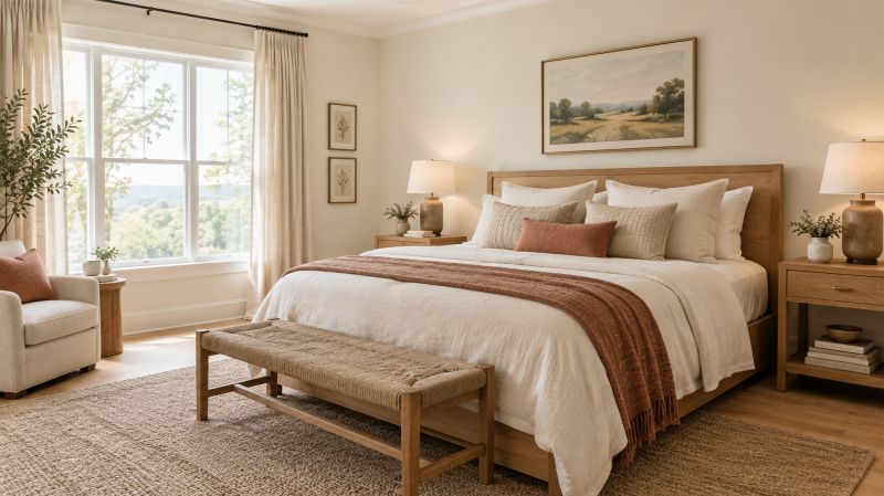
Alabaster offers a gentle, creamy warmth that can soften rooms dominated by hard surfaces, cool daylight, or modern finishes. It is particularly appealing when bright white walls feel too stark for the atmosphere you want.
Use it in living rooms with oak furniture, bedrooms with natural linen bedding, or open-plan spaces that need a consistent neutral backdrop. Beige, terracotta, muted sage, and warm wood are natural companions.
Best for: Cozy living spaces, bedrooms, and coordinated whole-home color schemes.
Watch out for: Alabaster is not a completely neutral white. In a room with golden sunlight and warm artificial lighting, it may appear creamier than expected.
3. Sherwin-Williams Greek Villa (SW 7551)
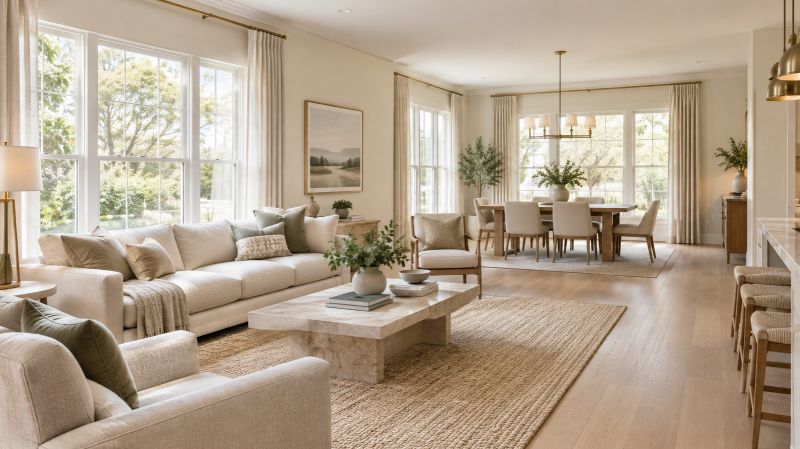
Greek Villa is a soft, inviting white for homeowners who want a fresh backdrop without the severity of an icy white. It can complement traditional, farmhouse, transitional, and contemporary interiors.
Try it with light oak flooring, natural stone, brushed brass hardware, or warm beige textiles. In a kitchen, it can create a cohesive look when the cabinetry and surrounding walls share a compatible level of warmth.
Best for: Open-plan living areas, bedrooms, and light, relaxed interiors.
Watch out for: Its warmth may become more noticeable in strong afternoon sun or under warm LEDs. Compare it with White Dove and Pure White before selecting a whole-home color.
4. Sherwin-Williams Pure White (SW 7005)
Pure White is worth considering when you want a relatively clean white that still has enough softness for residential interiors. It is a useful option for trim, doors, cabinets, and walls where an overly creamy appearance would clash with the design.
Pair it with gray countertops, natural wood, black fixtures, or restrained neutral furnishings. It can also help create definition between a wall color and architectural details.
Best for: Trim, cabinetry, modern interiors, and homeowners who prefer a cleaner white.
Watch out for: The name does not mean it is a completely undertone-free white. Its appearance can change against other whites and under different lighting conditions.
5. Benjamin Moore Simply White (OC-117)
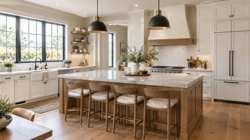
Simply White is a bright, lively white that can make a room feel fresh and open. It works particularly well when the goal is to create a light backdrop for colorful artwork, natural materials, and layered furnishings.
Use it in kitchens, entryways, and living rooms where you want a brighter appearance. Combine it with medium-toned wood, charcoal accents, or soft green décor for contrast.
Best for: Bright interiors, cabinetry, and spaces that need a crisp, welcoming backdrop.
Watch out for: Strong warm sunlight can make its warmth more noticeable. If you are especially sensitive to yellow undertones, compare a sample with Pure White before buying.
6. Benjamin Moore Seapearl (OC-19)
Seapearl is a useful option for homeowners who prefer a muted, understated white rather than a bright or distinctly creamy shade. Its subtle character can suit interiors that combine stone, wood, and neutral fabrics.
Consider it for bedrooms, living rooms, and spaces where a softer wall color helps furniture and architectural details feel connected. It works particularly well with restrained, earthy palettes.
Best for: Calm, neutral interiors and rooms with natural textures.
Watch out for: Its appearance can lean more muted than expected beside bright white trim. Test both colors together instead of evaluating them separately.
7. Sherwin-Williams Shoji White (SW 7042)
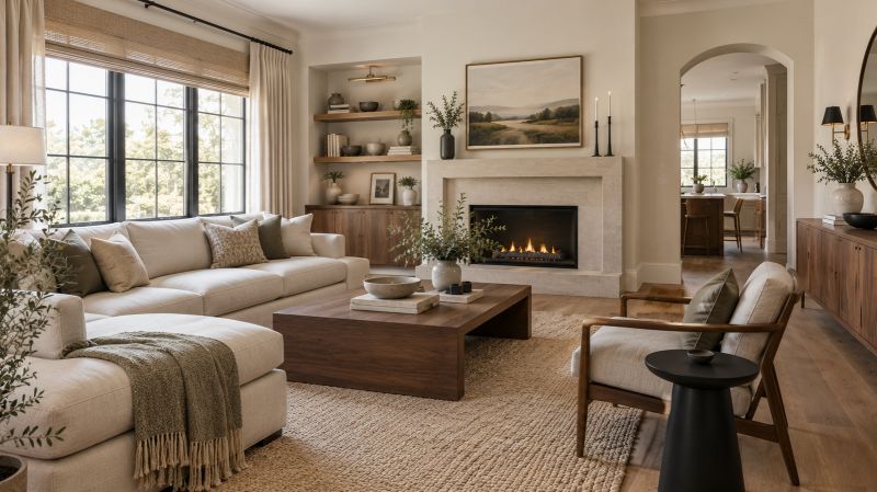
Shoji White is better understood as a light, warm neutral than a crisp white. Its greige character makes it a strong candidate for homeowners who want warmth without relying on a distinctly golden cream.
Use it with walnut furniture, natural oak, beige upholstery, textured rugs, and matte black accents. It is especially useful in relaxed, contemporary rooms where a little depth helps walls feel less stark.
Best for: Living rooms, bedrooms, and interiors with warm natural materials.
Watch out for: Shoji White can read beige or greige in some spaces. If you want walls that look unmistakably white, sample it alongside a cleaner shade.
8. Benjamin Moore Cloud White (OC-130)
Cloud White is a traditional soft white that can help a room feel comfortable and cohesive. It is worth considering for homes with classic millwork, warm wood furniture, and layered neutral décor.
Use it on trim, cabinetry, or walls when a softer finish suits the rest of the home. It can also complement cream-colored upholstery and natural stone.
Best for: Traditional interiors, millwork, and coordinated wall-and-trim schemes.
Watch out for: Its creamy quality may be too pronounced for homeowners seeking minimal yellow undertones. Confirm the exact current color code with the manufacturer before purchasing.
9. Sherwin-Williams Snowbound (SW 7004)
Snowbound offers a softer alternative to an intensely bright white and can work well in contemporary or transitional homes. It is worth testing when you want a light backdrop that does not feel overly golden.
Pair it with gray flooring, black fixtures, muted blue accents, or natural wood. In a kitchen, compare it against the undertones in your countertop and backsplash.
Best for: Modern kitchens, trim, and rooms with mixed neutral finishes.
Watch out for: Its undertones may appear different beside cream cabinetry or strongly warm flooring. The finished effect depends on the surrounding palette.
10. Benjamin Moore White Sand (OC-10)
White Sand is a warmer, more nuanced neutral that suits homeowners who like the softness of off-white but do not necessarily want a bright white wall. It can be attractive in relaxed interiors with natural stone, wood, and earthy textiles.
Use it in living rooms and bedrooms where the aim is a gentle, grounded atmosphere. Pair it with olive green, warm taupe, and medium-toned timber.
Best for: Earthy interiors, comfortable living spaces, and subtle neutral palettes.
Watch out for: It can look more beige than white in certain lighting. If avoiding yellow is your priority, sample it carefully before choosing it for an entire room.
11. Sherwin-Williams Oyster White (SW 7637)
Oyster White offers a subdued alternative to brighter whites. Its understated appearance can complement homes with wood beams, natural finishes, and soft neutral furnishings.
Consider it for living rooms, hallways, and open-plan interiors where you want a gentle wall color rather than a sharp contrast against the furniture. Pair it with creamy textiles, warm wood, and muted greens.
Best for: Relaxed interiors, architectural details, and natural-material palettes.
Watch out for: A muted white can look darker or more beige than expected in a room with limited daylight. Sample it on more than one wall.
12. Farrow & Ball Wimborne White (No. 239)
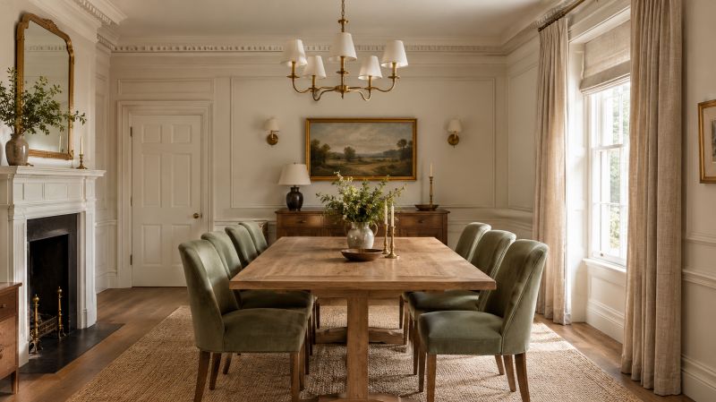
Wimborne White is a warm, traditional white that can work beautifully in homes with classic architectural details or carefully layered neutral décor.
It is worth considering for living rooms, bedrooms, and spaces where the wall color needs to coordinate with painted woodwork. Pair it with natural linen, green upholstery, and wood furniture.
Best for: Traditional homes, character-rich interiors, and soft neutral schemes.
Watch out for: It is not the safest choice for someone who wants the least possible warmth. Compare it with a cleaner white under your actual lighting.
13. Sherwin-Williams Pearly White (SW 7009)
Pearly White can suit homeowners looking for a light, restrained neutral with a softer appearance than a stark white. It can help create a calm backdrop for furniture and décor without introducing a strong color statement.
Try it in living rooms, bedrooms, and hallways with light wood flooring, textured fabrics, and muted accent colors.
Best for: Soft neutral interiors and rooms that need a light wall color.
Watch out for: Its perceived warmth and depth can shift with the room’s light. Do not assume it will match another white simply because both look similar on a paint card.
14. Sherwin-Williams White Duck (SW 7010)
White Duck is a muted off-white with a warm, understated character. It is a good candidate for homes where a bright white feels too sharp but a strongly creamy paint would be overwhelming.
Use it with oak floors, natural stone, beige upholstery, and earthy accent colors. It can help unify open-plan spaces that contain a mixture of wood, fabric, and stone finishes.
Best for: Warm, contemporary interiors and rooms with natural materials.
Watch out for: Its muted appearance may lean too beige for a crisp-white aesthetic. Compare it with Alabaster and Shoji White before deciding.
15. Farrow & Ball School House White (No. 291)
School House White is worth considering for a more subdued, traditional interior. Rather than looking like a brilliant white, it can provide a quiet backdrop for cabinetry, woodwork, artwork, and layered furnishings.
Try it in a dining room, living room, or character-filled bedroom. Pair it with deep green cabinetry, natural wood, antique brass, or muted earth tones.
Best for: Traditional and transitional spaces with a softer, lived-in look.
Watch out for: This is a nuanced off-white, not a bright neutral. If the main goal is to minimize visible creaminess, test it against Pure White or another cleaner white.
Warm White Paint Colors Compared
The table below summarizes how to shortlist the colors. The warmth descriptions are qualitative guidance, not laboratory measurements of yellow undertones.
| Paint color | General appearance | Best application |
| White Dove | Soft, balanced warm white | Walls, trim, cabinets |
| Alabaster | Creamy, gentle warmth | Living rooms, bedrooms |
| Greek Villa | Inviting soft white | Open-plan interiors |
| Pure White | Relatively clean white | Trim, cabinets, walls |
| Simply White | Bright white with warmth | Kitchens, bright rooms |
| Seapearl | Muted off-white | Neutral living spaces |
| Shoji White | Warm greige-white | Natural-material palettes |
| Cloud White | Traditional soft white | Millwork, classic interiors |
| Snowbound | Soft white with nuanced undertones | Modern kitchens and trim |
| White Sand | Beige-leaning off-white | Earthy, relaxed rooms |
| Oyster White | Subdued neutral white | Living rooms and hallways |
| Wimborne White | Traditional warm white | Character-rich interiors |
| Pearly White | Soft, light neutral | Bedrooms and hallways |
| White Duck | Muted warm off-white | Contemporary natural palettes |
| School House White | Subtle, traditional off-white | Dining rooms and living rooms |
How to Choose a Warm White Paint Color That Won’t Look Yellow
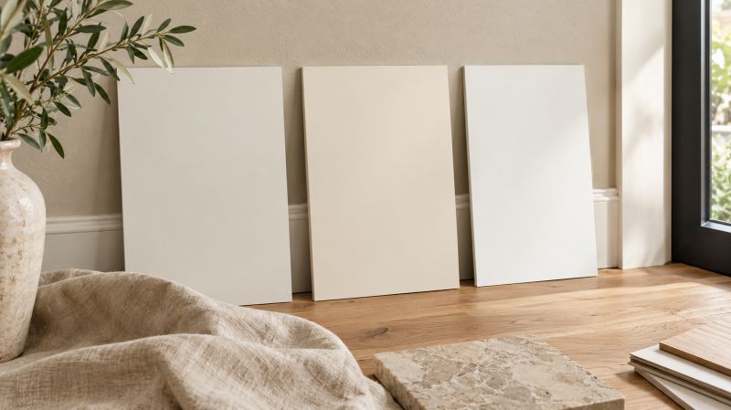
Understand warm white versus creamy white
Warm white paint colors have undertones that can include yellow, red, or orange. Creamy white paint colors generally look richer and more visibly warm, although the two categories overlap.
If you want warmth without a golden cast, start with balanced shades such as White Dove or Pure White. If you prefer a softer, more traditional atmosphere, compare Alabaster or White Duck as well.
The distinction is about degree, not a strict boundary: a warm white can look clean in one room and creamy in another.
Consider lighting and room direction
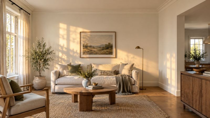
Natural and artificial light influence how a paint color appears. North-facing rooms often receive cooler daylight, while direct sunlight and warm artificial bulbs can make warm undertones more noticeable.
For a north-facing living room, test a soft white beside the flooring and furniture. In a bright, west-facing room, check the sample during late afternoon, when sunlight may make a creamy shade appear more golden.
Sherwin-Williams explains how room orientation and light affect paint selection in its color-by-room-orientation guide.
Coordinate paint with floors, furniture, and trim
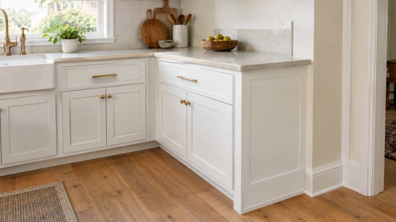
White walls do not exist in isolation. Oak flooring, cream upholstery, cool gray countertops, and bright white trim can all influence how a wall color is perceived.
For a warm, natural look, combine a balanced white with oak, linen, sage green, and brushed brass. For a cleaner contemporary scheme, consider a less creamy white alongside gray stone, black hardware, and restrained wood accents.
If your home already has warm floors, avoid choosing a strongly creamy white without testing it beside the wood. The combined warmth can make the walls appear more yellow than expected.
Understand light reflectance value (LRV)
Light reflectance value, or LRV, describes how much visible light a color reflects on a scale from 0 (black) to 100 (ideal white). It can help you compare the relative lightness of paint colors.
However, LRV does not tell you whether a paint will look yellow. Two whites with similar LRV values can have different undertones and appear quite different beside the same furniture.
Use LRV as one selection tool alongside undertone, room lighting, and sample testing.
Best Warm White Paint Colors for Different Rooms
Living rooms
White Dove, Alabaster, and Greek Villa are useful starting points for living rooms. Pair them with natural wood, comfortable neutral upholstery, layered rugs, and accent colors such as sage green or muted blue.
For rooms with abundant warm sunlight, compare samples in the late afternoon before choosing a creamier shade.
Bedrooms
Alabaster and White Dove can create a soft backdrop for linen bedding, upholstered headboards, and warm wood furniture. If you prefer a less creamy appearance, compare them with Pure White under your bedroom’s evening lighting.
A coordinated palette of warm white, muted green, and natural beige can make the space feel cohesive without relying on strong wall colors.
Kitchens and cabinets
Pure White and White Dove are useful candidates for cabinets, while Greek Villa may suit a kitchen with warm wood and natural stone.
Check the paint against the actual countertop, backsplash, flooring, and appliance finishes. A cabinet white that looks neutral by itself may appear yellow beside a cooler white quartz surface.
Trim, doors, and ceilings
For trim, choose a white that complements the wall undertone rather than automatically selecting the brightest available white. Using different whites can create subtle contrast, but the difference should look intentional.
Test the wall and trim colors together. This is particularly important in open-plan homes, where the same trim is visible from several rooms.
How to Test Warm White Paint Before Painting
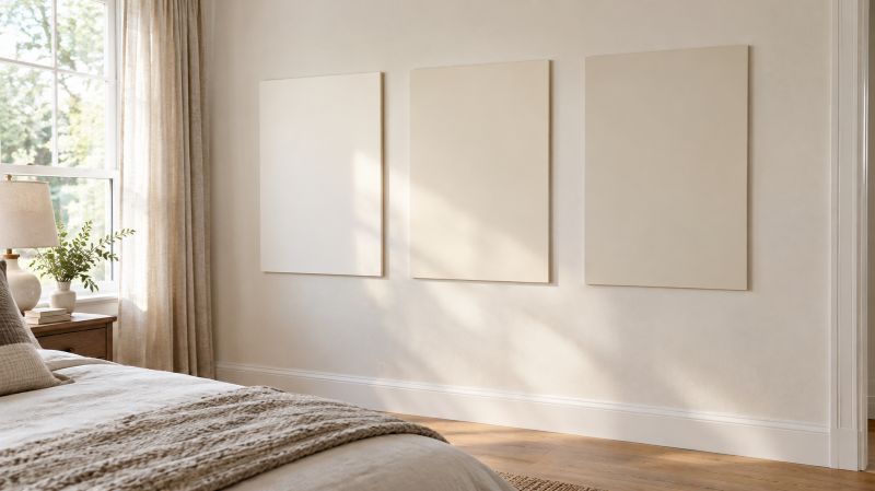
- Choose two or three finalists. Start with shades that fit your preferred warmth and compare them rather than sampling every color at once.
- Use large sample boards. Paint sample boards or use suitable peel-and-stick samples, following the product instructions. Large samples make undertones easier to evaluate than tiny chips.
- Check multiple times of day. View each sample in morning, afternoon, and evening light.
- Compare existing finishes. Place samples near your flooring, cabinets, countertops, curtains, and upholstery.
- Evaluate artificial lighting. Turn on your normal evening lights and check whether the paint becomes too creamy or yellow.
- Confirm the finish. The sheen can influence how light reflects from a painted surface, so evaluate the finish intended for the project.
The extra testing time can prevent an expensive repaint and help ensure the finished room works with your existing home décor.
Common Mistakes to Avoid
- Choosing a white from an online photograph alone.
- Assuming every warm white has the same yellow undertone.
- Confusing brightness with undertone neutrality.
- Ignoring the color of existing floors and countertops.
- Selecting trim and wall whites independently.
- Forgetting to check the color at night.
- Buying paint for the entire house before testing samples.
Final Thoughts
The best warm white paint colors create a comfortable backdrop for everyday life while allowing furniture, flooring, artwork, and architectural details to stand out. White Dove, Alabaster, Greek Villa, and Pure White are useful starting points, but the best shade for your home depends on the look you want and the conditions in which the paint will be viewed.
Before committing, compare two or three large samples, check them throughout the day, and evaluate them beside your permanent finishes.
Ready to refresh your home? Choose your favorite two or three whites, test them on your walls, and select the shade that looks balanced in both natural and evening light. A thoughtful paint choice can make your next home improvement project feel cohesive, intentional, and beautifully finished.
Frequently Asked Questions
What is the best warm white paint color that doesn’t look yellow?
Benjamin Moore White Dove and Sherwin-Williams Pure White are useful starting points if you want a softer or cleaner white without an obviously golden appearance. Test both in your own lighting because neither is guaranteed to look identical in every home.
Which Benjamin Moore white has the least noticeable yellow undertone?
White Dove is a popular soft-white option, while Simply White is a brighter alternative. Their perceived warmth varies with lighting and neighboring finishes, so compare samples before making a final decision.
Which Sherwin-Williams warm white looks the least yellow?
Pure White is worth testing if you want a cleaner-looking white. Alabaster and Greek Villa offer more noticeable warmth, making them better candidates when you prefer a softer, creamier atmosphere.
Is Alabaster or White Dove less yellow?
Both are warm whites, and the difference can be subtle. White Dove may feel more balanced in some interiors, while Alabaster often appears creamier. Test them side by side under your room’s daylight and artificial lighting.
What is the difference between warm white and creamy white paint?
Warm white describes a white with a warm undertone. Creamy white generally has a more noticeable ivory or cream appearance. A creamy white can be beautiful, but it may be unsuitable if your priority is avoiding visible yellow.
Why does my white paint look yellow on the walls?
The paint’s undertones, warm artificial lighting, direct sunlight, and surrounding finishes can all contribute to a yellow appearance. Compare the paint with a cleaner white sample and evaluate it under different lighting before deciding whether to repaint.
What warm white paint is best for kitchen cabinets?
White Dove and Pure White are useful starting points. Compare your samples against the countertop, backsplash, floor, and wall color. Cabinet paint should also be appropriate for the surface and application.
What warm white works best in a north-facing room?
Consider White Dove, Alabaster, or another balanced warm white, depending on how soft or clean you want the walls to look. North-facing daylight can make some colors appear cooler, so test samples in the room itself.
Can warm white paint work with gray floors?
Yes. A balanced warm white can soften gray flooring and make the room feel more inviting. Choose a shade that complements the specific gray undertone rather than assuming every gray floor needs a creamy white.
How can I stop warm white paint from looking yellow at night?
Test your paint with the bulbs you normally use. If the color becomes too golden, compare a cleaner white or try a different suitable bulb color temperature. Reassess the paint before repainting, because both the light source and the wall color affect the result.